The Horticultural Society of New York (HSNY) Hosted its Annual Floral Design Showcase, Tuesday, April 12th. According to HSNY, the event was previously known as Flowers & Design. This year, the event will “reprise the spirit of The Hort’s famous and historic New York Flower Show.”
What’s your table wearing this season?
If those stalwart-looking candlesticks are bearing up too much like last century Buckingham Palace guards or that bowl of fruit plopped in the middle of the table is so ho hum/too van Gogh-ish – you could gasp with awe and inspiration upon entering the Horticultural Society of New York’s (HSNY) appointed landscape showroom held at 583 Park Avenue for a private viewing and a one-night benefit.
Now this is taking tablescape design up a notch or three.
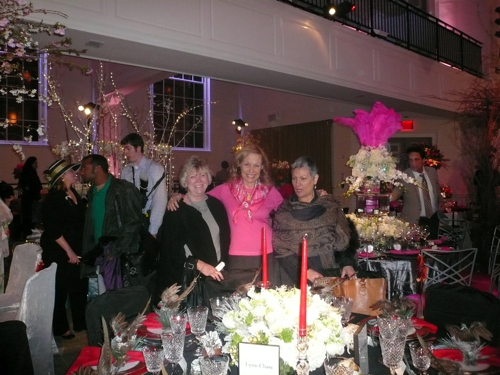
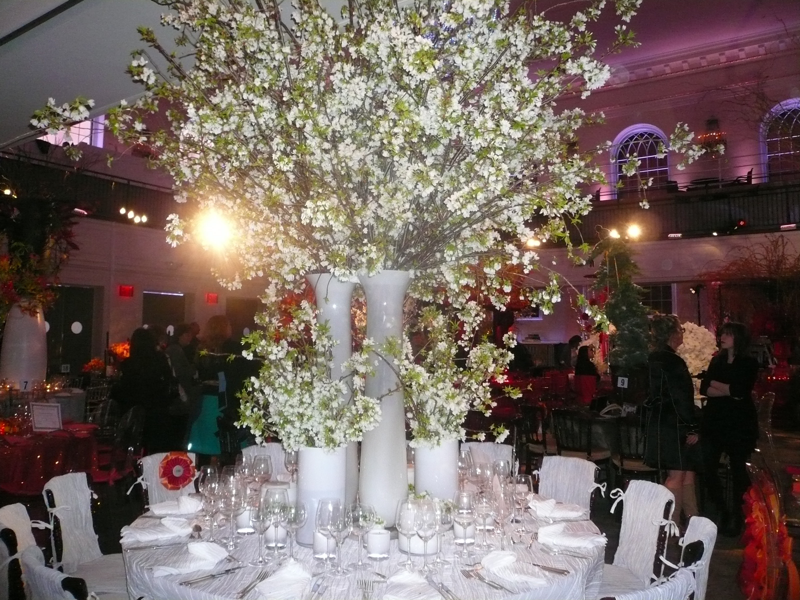
There were 30 table designs featuring the Who’s Who of floral design in New York City.
All were asked to interpret the HSNY 2011 theme of Fire & Ice.
At first look, the room featured a lot more red for Fire than any Ice-looking creations.
Hmmm. What does that say about the heart-throbbing New York floral designers?
In fact, decidedly taking the contrarian approach was Riverdale floral and event designer, Diane Wagner:
www.dianewagnerdesigns.com who earned an award for her creation. The judges cited her accomplished “Delicate Harmony.”
Looking as cool and serene as her glacial garden tabletop, Diane explained she chose to do “ice” as she accurately figured most of the entrants would work with a fire composition. (I must remember to ask Diane her thoughts about the lottery or the stock market…)
In any event, her instincts served her well.
She chose a blue-colored theme, explaining it gave more depth to the table.
I especially liked how she combined a low vase floral design with an elevated one.
I could readily embrace the pragmatism of talking over the low-look flowers while admiring the soaring floral design above.
Wagner said she does mostly weddings and uses a lot of flowers.
She described how she also incorporates other intriguing plant material. She gave a few examples citing a recent vegan bride, in particular.
“I used a selection of asparagus, thistle, mushroom, and artichoke in the floral design and tablescape.” Sounded deliciously decadent and very creative.
The Answer to What Came First: The Chicken or the Egg
The most amazing story of the show: an it-could-only-happen-in-New York City-kind of story. And understandably a topic of conversation since then, is that of the tablescape creator of the English, hunt-looking table design with its pheasant napkin rings that would make Ralph Lauren rather pea green with envy.
I was attracted to the table by it’s stellar design, no doubt, and also by the fact that I could see myself setting such a table – as opposed to the more fanciful, red-carpet, over the top designs that punctuated the room.
A woman came up to me asking what I write and I explain I blog and write books about gardens and food. She almost claps with delight and tells me this is just perfect as she has a story about both.
Well, in no short order I discovered a most fascinating tale.
Without knowing who the tablescape designer was, I found myself talking to a most eager, energetic and attractive woman. It turned out she was the designer.
She launched into her story behind the table’s creative composition explaining that she’d gotten to the show by way of a fan letter to the dinnerware china artist, Lynn Chase, (
www.lynnchase.com) renowned for her wildlife tableware designs.
Chase also founded the Lynn Chase Wildlife Foundation dedicated to preserving wildlife and the environment.
Later, I think that part about the path to the show via the fan letter might have been perhaps somewhat sweetly disingenuous yet convincingly self-effacing.
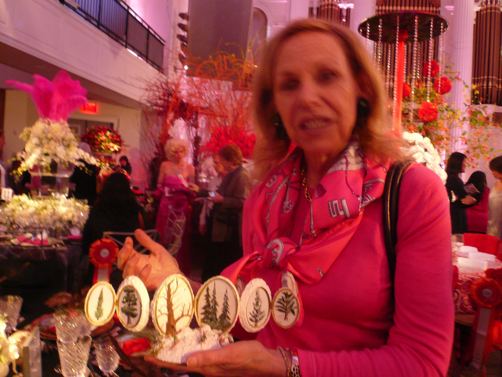
I was looking somewhat confused at that point; so the designer went on to explain that she was the “Egg Lady.”
What?
I hadn’t yet taken in the egg art on the table.
It was only my second table stop after HSNY’s George Pisegna’s icy tabletop design. One of four George created.
The attractive Egg Lady rose to new heights of curiosity in my estimation.
She points to the egg place card holders and picked up an original egg design, proceeding to tell me what an egg decorator is and how she came to this art.
“Do you have a moment?” she asked politely before proceeding.
“I was in a very bad car accident in 1993, “ she said. “I was looking for something I could do (presumably while convalescing). “I took a correspondence course in egg art design that was not unlike TV’s Bob Rose.” She paused. “Do you know who Bob Rose is?” observing my blank stare.
Never mind, we mentally agreed.
She said it took her more than a year just to learn to use a dentist’s drill to cut the fragile top of the egg to better create her designs.
It was then I delightedly discovered she had ample access to an egg inventory for rendering her egg art.
Her husband was none other than Frank Perdue!
She grinned with delight as she said with a well-practiced dramatic flair, “So. We can surely answer the question of ‘What came first, the chicken or the egg.’ It was the chicken!” she pronounced gleefully.
A widow now, Mitzi Perdue moved to New York City after Frank died. “There’s so much to do here, “ she said rapturously. So where she’d made up to 30 or so egg art creations that sit like jewels in her home display case, she now makes one or two.
There were a variety of egg art designs on the table I observed.
There was a fold-out one that featured trees.
Mitzi explained that she and Frank often took walks and Frank loved trees. I couldn’t help but say, “Yeah for Frank for loving trees. We need more of them. I love trees too.”
She shows off the hand-painted trees on the egg art’s fold out screens.
I ask if she ever took watercolor classes. I did and can appreciate her talent. Turns out she just has the gift, no training.
Returning to the egg art, Mitzi was now holding a Faberge-looking diorama.
I commented how we live somewhat cater-corner to the Forbes building downtown and would often take out of town guests to see Malcolm Forbes’ distinguished Faberge collection and before I can say more, she says, “My cousin Astrid married Kippie Forbes!”
(I wanted to tell her that I’d often received those ad-marketing invitations from Kip to join the magazine staff on the Highlander yacht. Maybe we can talk about this when we go for tea soon.)
But what I do say is, “This is getting creepy,” referring to all the coincidences and things we have in common!
Without missing a beat she says, “You mean creepy in a funny way, right?”
“Right.” J
I am so loving my new friend..
Back to the table design, I’m now a bit confused about the china connection…
“Do you have another moment?” she asked with utter courtesy.
By this point, I was now completely smitten and gave myself over to Mitzi even though I had planned to skate through the exhibit. I found I was rather nailed to the spot.
“One year when Frank I attended Wimbledon,” Mitzi began. “We’d pass a lovely shop there that displayed this china in the window.” She recalled how every day she would comment on the china’s superlative design and secretly hoped she might somehow buy a few place settings. To no avail. Frank didn’t acknowledge her object of desire.
On the last evening there, they were going to dinner. At a restaurant that was right next door to the shop. Curious, she thought. The shop was closed. Her heart sank.
Suddenly, Frank took her by the arm and said, “Look, the shop is glowing.” She turned to see the shop was lit from within. A butler of sorts was holding a silver tray studded with a candelabra, a bottle of champagne and three glasses. (At this point, I might’ve thought I’d had too much champagne during the day and my eyes were deceiving me. But this is not my story…)
Frank said, “Let’s go in.” Turns out, it was the owner as butler. Frank had made arrangements for the shop to stay open for Mitzi. The merchant asks if there’s anything she’d like, and she says haltingly, “Umm yes. The dinnerware.” She’s asked how many she’d like. She says she didn’t want to appear greedy so she politely asked for four place settings whereupon Frank turns to the shop owner and says, “My wife would like a dozen place settings, please.”
Mitzi still looks incredulous.
I ask if Frank was always such a love bug. She demurs, saying he did indeed often do sweet things like this…
I love that.
This is the story she sent to Lynn Chase as the fan letter just a few weeks ago. It is indeed a great story made all the better as it brought them together for the HSNY Tablescape exhibit. What a team.
www.bhealthy.com and
www.mixedgreenevents.com
I hate to leave this cheerful, happy woman and her world of design. We exchange business cards and I tell her I will let her know when I post the story. She smiles with welcoming warmth and says we will be Friends on Facebook where she’ll link the story and will Tweet about it too.
Twitter and Tweet from Mrs. Perdue the chicken and egg lady?!
You know how the next sentence went. Tweet, tweet.
Floral Designers
Back to the magic of the show. There were plenty of fantasy worlds to explore.
I especially respected the work of #27 GreenHouse, HSNY Rikers Island designers. http://tiny.cc/e3waa
Their dragon-topped red design was well done and thoughtful.
Flowers by Daye, #8, received a Certificate of Award for mixed greens event design.
It was a bold contrast and elevated heights.
www.flowersbydaye.com
I especially loved the table design by HSNY George Pisegna, #30. It was cited by the judges for seasonal creativity. The cool blue eggs were striking next to the seasonal flowers. George was explaining to the TV camera how he wanted to use a lot of materials one would find at home to create the tablescape, such as the cake stands and floral blue stones.
I liked the little ice candles and French tulips on #5, Laura Clare, Floral Design & Event Décor,
www.lauraclaredesign.com
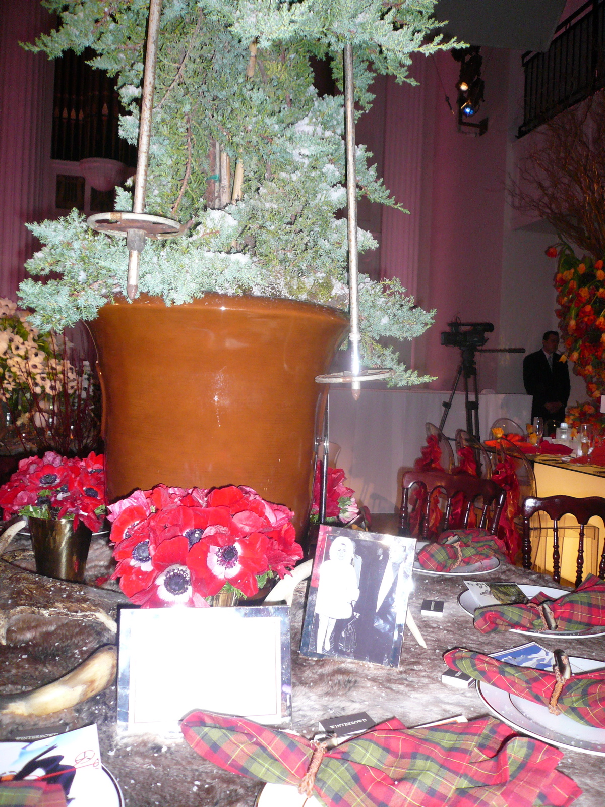
Rod Winterrowd Inc, #9,
www.rodwinterrowd.com was a refreshing tartan look that supported a topical narrative:
Elizabeth Taylor – with Richard Burton – at their Gstaad retreat. It was all snow bunnyish -- skis gracing the tabletop’s snow-dipped conifer, postcards as place cards.
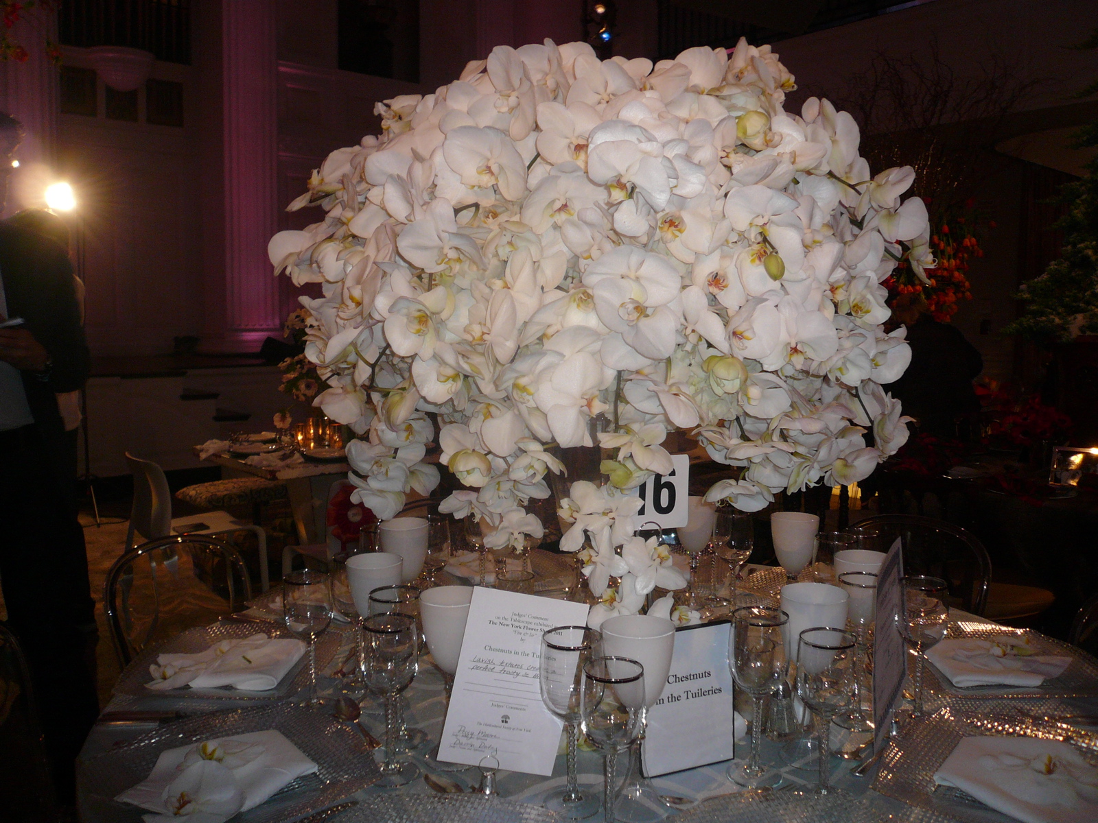
Chestnuts in the Tuileries, #16 won a certificate award. It boasted lavish textures to create a perfectly frothy setting.
www.chesnutsnyc.com
Rebecca Cole’s GROWs
www.rebeccacoleGROWs.com was a rustic looking ice-themed design.
She used wire cages filled with logs topped by covered cushion seating.
Two white tables on either end of a center, birdbath fountain filled with candles, burlap and red-twigged dogwood stems.
The tables were abundant with white and purple-eyed anemones.
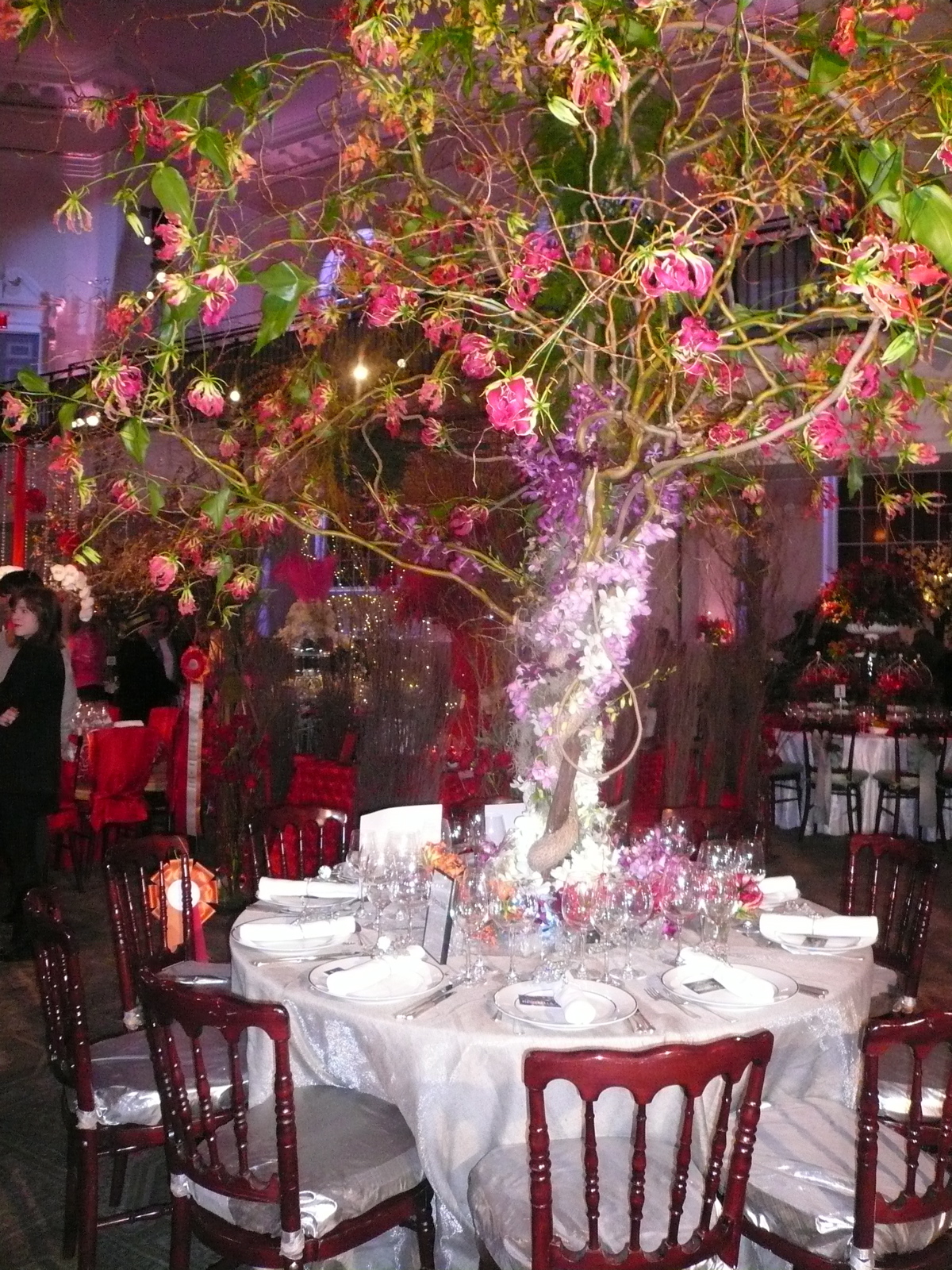
Fleurs Bella, #3,
www.fleursbella.om deservedly earned a certificate award for Most Distinctive Horticulture.
The table was swathed with a rich variety of orchids, swirling up the tree that anchored the table.
and the napkin rings were spectacular were a floral spark.
I didn’t really like the design that much for #23, Douglas Koch Designs Ltd, but I did appreciate the concept of using a fire pot or Sterno cooking fuel in a tabletop design.
A different execution would have worked better for me and I made a note to try this in a future home design, along with candles.
I did love the orange and pink colors and use of lots and lots of floral displays in the Moroccan themed #25, Plant Fantasies Incorporated. Beautiful.
Some years ago I wrote a feature piece about Jerry Rose for the now defunct magazine, MAR, that I will resurrect and post, given this inspiration.
Like Cinderella, I scooted out just as the HSNY was announcing the close of the show. Earnest preparations were on for the evening’s cocktail benefit fund-raiser.
What a glamorous setting for the evening ahead …