|
| Timothy Whealon Interiors White Orchid Room for Kips Bay Decorator Show House |
Ah yes, as I was saying, the White Orchid Room was my favorite bedroom at this year’s 44th Annual Decorator Show House. And while we’re at it - don’t you think we should name our own home’s rooms? I do. For the interiors and exterior garden “rooms” - for me and my clients. For example, there is the Mermaid Bathroom, the Bespoke Suit bathroom, the Speakeasy Bar, The Dinosaur Garden, The Alice in Wonderland Garden -- and so on. See how much fun this is? And so much more personal than “upstairs, on your right.” Initially, I think the construction teams find this over the top, indulgent, but over the course of the projects, I see that they too take no small amount of pleasure and pride in the monikers as they see the final product fulfill the vision of the room’s name. (And if boutique hotels and royalty, not to mention the White House, can name rooms, surely we can too!)
So it was with keen anticipation I entered the White Orchid Room from Kati Curtis Design’s extraordinary, artful wallpapered staircase, landings,

and lighting and art and the fourth floor nook and its exceptional use of space that others might gloss over some banal window seat or desk.

Here, Kati used the niche to create a compelling composition complete with Indian silk painting celebrating the twelve stage of life, juxtaposed with a sleek Italian chandelier, a rich cadmium orange or curry silk, shirred/relaxed roman shade and it’s dynamic couture pleated look, accessorized with a classic Asian seat and an elegant burlwood armoire. Once could get lost daydreaming and admiring this diminutive space. Who needs big?
The White Orchid Room was all cool elegance - I could feel the zen the room offered just walking in. The soft, relaxing color palette of cool lavender, fresh spring green and white. The upholstered “four poster” bed by Maison de France was tailored yet relaxed.
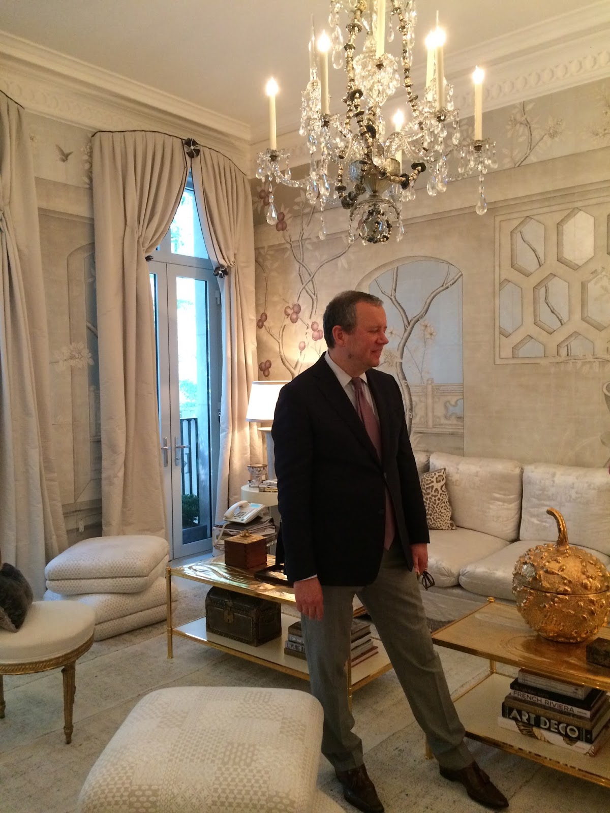
The plastered walls were pure genius. This is a Timothy Whealon decorated creation and his appealing style blends delightful details with livable, can-do living environments. You look at this room and think, “I want to live here” vs. a “Wow, but could this ever work design?”
The custom designed walls are leaves in bas-relief and then painted - by Osmundo Echevarria & Associates studio. It’s a subtle but enchanting treatment.

The ceiling - or that “fifth wall” was done in a glazed design. The windows were almost floor-to-ceiling and the look of white sheers in a trellis pattern added a refined garden touch. Maison de France did the window treatments, too in F.Schumacher fabric. The Maison Gerard gold standing lamp was a glittering nod to the bas-relief leaves on the wall. The Soane Lighting wall sconces and Claremont sconce shades were featured in a repeat between the windows. The uplighting was dreamy and soft…

On the other, street side of the townhouse, the Les Ensembliers “Le Jardin Secret” bedroom was formal, structural, and spare - in a good way - amplifying that “less is more” rule of design. Les Ensembliers claims it bring together construction, architecture, and design - and clearly all were revealed in this gorgeous room. Oh, there were details - subtle ones, such as the fabric wall papers by Ralph Lauren through Kravet - was extended even to the molding and the hvac unit. Who says technology has to be hidden. Well, just redefined…

The floor to ceiling window curtains and the silk duppioni back of bed by Brunschwig & Fils were exquisite in color and volume adding to the pure luxury of the room.

The airy lattice-like “coffee” table was a silvery grey, echoing the wall paper pattern and color and texture of the Kravet chairs and fur throw.

The Drake/Anderson designed “Master Floor Library” was a rich, “pond-scum” green, an oriental run on sisal, smoky mirrors, a game table, fireplace and lots of doors and windows.
A surprise was the Sawyer | Berson Terrace off the “Petit Salon” and its fabulous, patterned Durite floor. Just outside the door was a green dream - or Dali-esque surreal idea of a rooftop garden that seemed to lure me out. I asked if I could venture out there as the flooring didn’t seem real or grounded.

The docent said “yes,” and I walked out to what was a faux lawn or a kind of astro-turf that was like a carpet - and yet had real arborvitae confers populating the garden room like so many life-sized Christmas Nutcrackers. The look was unsettling for a gardener/horticulturist like myself, yet fun and intriguing. I couldn’t help but send an image to my friend Charles at NYBG! We admired and laughed. Isn’t that what good design promotes? Indeed.

Walking to the end of the green dream - I found myself looking down at a very furnished, black and grey colored Daniel Richards Design garden terrace - the “Urban Oasis” with well-designed plantings (real plants!) featuring Lace Cap Hydrangeas, potato vines - both chocolate and green, and terrace art, including Joe Wheaton sculpture, ceramic bowls, and planters from Belgian-based Atelier Vierkant in a bowood surround.


Walking back into the interior, there was a sophisticated family room (in fact it was called, “Sophisticated Simplicity”) and created by Suzanne Kasler Interiors that led to a wowsy kitchen, designed by last year’s heart-clutching kitchen designer, Clive Christian Interiors. Christian brands himself as the "creator of the luxury kitchen." While there may be room for debate about that - there is no argument that his gorgeous kitchens are glamorous show stoppers. This one was no exception. Understated - all the glamour is in the details. Of note, the back-lit Lalique glass panel inserts on both sides of the range. It was explained that the same molds were used for the panels that were used to produce the crystal art for the legendary Orient Expres passenger trains to adventure and discovery. These Audubon looking birds on the glass panels were explained to be the inspiration for the sliding, custom-crafted wood panels that fronted the wet bar. The White HazeAkdo tiled backsplash pattern was supreme. I also liked the tiered, mirrored inserts in molding on either side of the open transition to the kitchen dining table that was located between the kitchen and family room. Kudos Clive Christian.


I asked what happens to the room after the show and was told the new owners were to take it all out to put in their own design. Whaatt? I’m so hoping this is not true. This kind of interior design art should be preserved or sold or -- I heard that last year’s kitchen was purchased in total.

Mirrored panels in molding detail
The designer Alex Papachristidis was on site in his fabulous “Salle Ǻ Manger Glamour” room. He was genuinely, joyfully explaining his design choices and backstory. This is a learned designer who clearly respects his profession and offers informed, researched, and exotic selections. What a refreshing, exciting tour of this truly glamorous room. “I like to mix 18th Century pieces and design for a fresh mix in the right way,” said Mr. Papachristidis. “That era produced the best furniture ever made,” he explained. He added that he honors the classics and respects the historic undertaking of the decorative arts and seeks to showcase them to contemporary customers and audiences. I love that sentiment and couldn’t agree more.
Designer Alex Papachristidis, Kips Bay Decorator Show House 2016
Every detail of his Salle Ǻ Glamour had a fascinating narrative of the craftsperson and/or the provenance. The metallic-looking walls were hand painted by Gracie Wallpaper.

The hand-painted dining table chairs were exquisite in a floral design sourced from Dalva Brothers 18th Century French furniture dealers, with a look that was at once contemporary, yet not … Certainly, an enduring design. There were museum quality busts and sculpture gracing the room, including obelisk, torchiere, and garniture from Liz O'Brien Home.

There were gold chairs next to the fireplace that to my eye, picked up on the coffee table with molten gold and mother of pearl that had some provenance with the Duke and Duchess of England - as in Edward from WWII era.

Besides the hand-painted chair florals, my favorite item in this room was Mr. Papachristidis’ selection of a Turkish tent material sewn or stitched together to make a unique rug presentation - that worked perfectly over the stenciled floor from Boxton Interiors. And that is precisely why we love to explore show houses. For the creative, inspired design genius that continues to provide inspired excitement, glamour, and discovery.


Also striking was the David Collins Studio blue paneled mirror and moldings in Farrow & Ball's Cook's Blue with Lutyens furniture and lighting. Looked Williamsburg - the colonial attraction not the Brooklyn neighborhood - but glossier.

I also appreciated the cork board wallpaper treatment. It was unexpected and rather glamorous as well.


Thank you and congratulations to all the talented designers, artisans, and decorators and craftspeople. And thank you Kips Bay Decorator Show House.
One more day - and then cheers to next year.