The calendar for home renovation seems to be in a similar
class as that of dog years.
Or a space-time continuum.
It’s just that things go slow, then swoosh along, only to
hit a pothole, before racing full steam ahead.
It’s like a motorcar that stops and stalls – but the driver knows he’ll
push the throttle and get this baby home!
The Home Renovation Diary Update marks the successful
completion of the painting in the home’s addition, and on to the delivery of
the reupholstered living room furniture that is styling new shades of a cadet
or sea blue for the slipper chair
 and the kitchen island stools, and a softer shaded
trompe l’oeil of subtle cornflower to sky blue set off with marquis patterned
top-stitching with yellow to gold dot joints (that pick up the kitchen and
fireplace and fireplace wall of creamy yellow and gold, respectively, for the two
love seat couches – to accessorize the blue bay beyond the living room’s
composition window view perch.
and the kitchen island stools, and a softer shaded
trompe l’oeil of subtle cornflower to sky blue set off with marquis patterned
top-stitching with yellow to gold dot joints (that pick up the kitchen and
fireplace and fireplace wall of creamy yellow and gold, respectively, for the two
love seat couches – to accessorize the blue bay beyond the living room’s
composition window view perch.
I ordered the kitchen stools online from Ballard Designs. They are the nicest, most helpful team of
decorating professionals.
The only slight snafu is that I ordered the custom fabric
from the local upholstery pro in order to match the living room slipper chair –
and he recommended some yards less than Ballard suggested. He said he only used a little under five
yards for the entire chair so couldn’t imagine that they would need near eight
for the back and seat cushion. So I urged
Ballard to talk to their outsourced upholstery professional and get them to be
more realistic – especially at more than $45 a yard.
It all worked out and in less than a month or so, the
completed stools arrived.
Of course the delivery had to be the morning I was racing to
catch the ferry back into town. And I
was waiting for the decorative painter, Stacey, who was designing and
completing the wall art, transitioning the loft room color to the garden dining
room color. More on that in a second.
UPS must have smelled my urgency, waiting like a cunning cat
till I was at the point of departure, when he knocked the door and fled like a
schoolboy prankster.
Now I had to bring in those four huge boxes because my fairy
housemothers, aka Mother and Aunt Margaret, wouldn’t have been able to quickly
maneuver them inside nor would that be fair to them… So like a longshoreman, I hauled them in and
raced down to the ferry dock – but not before ripping open a box top to peek
inside and enjoy my first looks at the lovely new blue counter stools, complete
with metal foot kicker, dark brown wood legs and base and silver grommets to
match the kitchen appliances.
All the better to sit and enjoy the sky-like blue - complete
with clouds - of the marble kitchen island, the cook in the kitchen, and the
New York skyline on the other side.
Yes, the stools turn and spring back to crisp attention.
 |
| Blue upholstered stools highlight the blue marble of the kitchen island |
I didn’t leave the starting line in my race to catch the
ferry before wishing Stacey well on her redo of the wall art transition.
The wall art started off as a brilliant design concept –
dreamed up by me J
I thought I could capture the extraordinary color
transitions from the sunrises and sunsets that we bask in at our home on the
water.
Sunrise from the right and the sunsets from the left are both
dazzling, shimmering performance art -- and the color transitions embrace the
rainbow spectrum.

I especially wanted to capture that blue to orange
syncopation.
The loft room is Benjamin Moore Dix Blue – mirroring the
blue-green water beyond and the patina of the copper I left on the fireplace
that was the outside but is now the inside wall.
The Garden Dining Room is the Martha Stewart Sherbet/Gold
shimmering color and texture described in the Garden
Glamour Home Renovation Diary Update April
With the two rich colors and the bay view beyond, combined
with all the sensual elements in between, I dreamed up an ombre color
transition between the two spaces.
I tried it out with the wall paints on a spare sheetrock
sample.
It came out good, if I do say so myself! (I also do
watercolors and I’ve been told that my final colored landscape design
“blueprints” are like works of art. Some
of my clients frame them.)
Everyone liked my ombre.
I couldn’t wait to add my personal Georgia O’Keefe artwork
to our home and join the lads painting away on other parts of the addition. Ha!
Alas, it was not meant to be.
Shockingly, I discovered I have a kind of vertigo. I’m afraid of few things, and this was most
embarrassing to learn that without a railing up (too early for that), I
couldn’t lean over, or even get close to the edge of the loft in order to
render my ombre… Even if Bill held my waist, which is really no pose for a
working artist, anyway.
This was a big setback in more ways than one.
But Roy, the painter was magnanimous, saying no harm in the
vertigo admission. In fact he knew of someone who he thought could do the
job.
Crunch to the budget. I hadn’t planned on this expense…
Soon enough, we were working with Stacey.
She seemed confident, talented, possessed a great online
portfolio – and most important, was not afraid of heights.
She saw my painted design sample and said no problem. We exchanged some emails during the week
about the design. We wanted a small
footprint between the rooms, as there is nothing separating the rooms.
I didn’t want someone to walk into the room and exclaim
about wall art – as divine as it could be in it’s own right – but rather to
admire the soaring ceilings, the sunlight or moonlight streaming in – and that
glamorous Martha precious metals sherbet wall color we’d worked so hard to
achieve.
Not to diminish the decorative art, but we didn’t want a
mural.
I realize ombre takes space, but thought we could modify the
process to suit our needs.
 |
| PDF rendering of suggested ombre for wall scanned in on actual wall & colors. Declined. Too much! |
By the end of the week, we thought we got it,
despite some rather elemental pdf visuals where Stacey took the sunrise image
and compressed it on the digital image of the wall.
With fingers crossed, and hopes high, the following Saturday
was art-in-the-addition day.
We had agreed that an ombre like solution could be a series
of the rooms’ colors: blue, peach, pinkish, and sherbet -- blending or morphing
into one another – from the blue to the sherbet. Nice, gentle transitions – like the horizon
at sunrise…
I spent the time writing upstairs in the La Boheme-like
garret that was and soon will be again: the guest room; while Bill worked
putting on the door handles in the addition room below the loft where Stacey
was creating.
The art work didn’t start off too good. In fact, there was
an initial whoopsie that took my breath away.
As Stacey started up the ladder with paint can in one hand
and brush in the other, the ladder started to slip away off the loft! I was speechless, gesturing to Bill with my
hands. Stacey had so much presence. Rather than go back down, which is natural
I think, she scampered UP the ladder
as it slipped away. If this hadn't been
so loaded with disaster, it would have been acrobatic entertainment.
With breathing restored and all precautions reviewed, we
were back to our stations.
I never want to oversee or make the professional artisans or
trades nervous with someone looking over their shoulder so if I’m home, I make
sure to stay out of their way.
Later that afternoon, with the work finished, it was time
for the look-see inspection. I was
filled with trepidation. Just like when Roy called me to see the finished
sherbet painting.
Unlike that inspection that yielded heart-holding joy, this
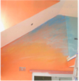
one was more of an “oh dear.”
I was tilting my head. Looking at it from different sides. But it was so much like a rainbow! The colors were too distinct. Too obvious. No
nuance. With courtesy and caution,
Stacey and I reviewed and she said she could remedy it.
Back to the garret. An
hour or so later: another call to have a look-see. My heart sank. Same reaction. Instinctually, I didn’t like it. Stacey knew it. We couldn’t look at each other. The deed was done.
It was getting late – near cocktail hour. We agreed we’d live with it a bit.
We did. For less than a week.

We asked Stacey to come up with some other solutions. She did.
She sent us this.
We agreed to do in our colors.
She returned the next week and redid the wall (for more
guilders), after we had to have Roy come back and redo the primer.
The result is it is beautiful, original art and is a
conversation piece – in a good way.

We love it.
You?
The “little things” make a BIG difference.