 |
| B.A. Torrey "The After Party" at Kips Bay Decorator Show House |
The design compositions are so filled with compelling narratives - yes, there’s a story each designer imbues their composition with -- a kind of fantasy framework for the completed look and world-class designs - that it takes two or three posts to report on the show.
To pay homage to the talent and hard work that contribute to the Kips Bay Decorator Show House, here is the second course -- or chapter two -- of this full-course presentation. Or so many chapters of a design book. Am I mixing my metaphors here? Food and literature… Hmm. Well, while I’m on the book reference, if you simply cannot attend this stellar show, you can indulge with the 40 Years of Fabulous: The Kips Bay Decorator Showhouse.
But there is nothing like walking through the seven floors of dreamy designs and talking to the talented designers and creators of all this magic.
So picking up where I had to leave off in the previous sneak peek show coverage here we go. Because More is well, More!
The entry hall foyer is a welcoming yet opulent visual treat. Mirrored walls, striped upholstered benches and wood chests - is at once grand and intimate. The Michael Herold design here is a celebration of a space dedicated to transition.


The Poussin inspired 17th Century wallpaper by Iksel Decorative Arts adorns the walls with bucolic landscapes; amplified by the mirrors. The antique bachelor chests stand sentinel-like on either side of the room, further performing as a palette for objects d’art.
Keeping with this year’s trend of employing Art, Herold placed Joan Miro lithographs low, atop the chests for a modern juxtaposition to the classic look to create a marvelous sense of balance.
Too often underused, Roman shades (I had a devil of a time getting a seamstress to make mine) mark the two windows here with a Schumacher silk, cloud-patterned fabric that allows natural light in. I use my flower-bordered Roman shades as a kind of scrim - allowing light in yet one can see out to the garden just beyond…
Finally, Herold embellished the walls and ceiling with gold leaf fixtures to add layered depth.
A nice detail is the Jo Malone Lime Basil & Mandarin scent surround diffusers that added a sensual element to this room’s’ comings and goings. I love this brand of fragrances and their heady, natural botanicals - the Mimosa & Cardamom is one of my signature fragrances…
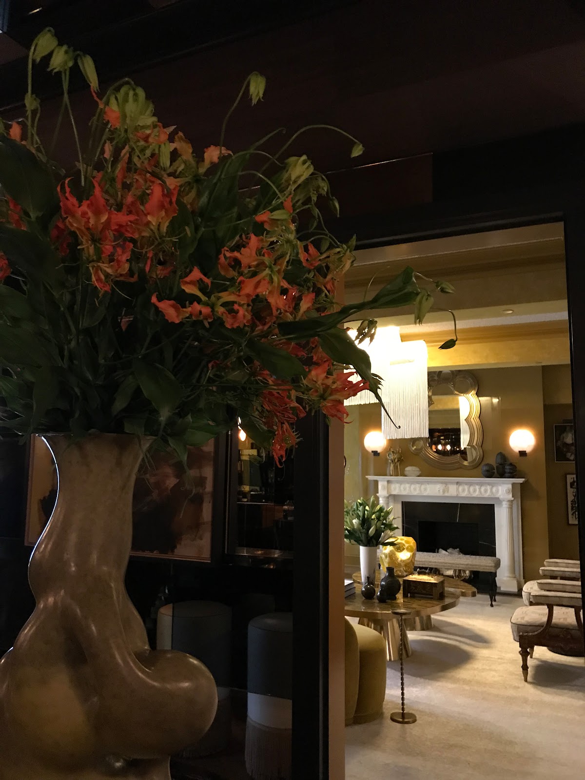
We walked downstairs next to the Juan Montoya Design. It’s an expansive living room with sweeping good looks.
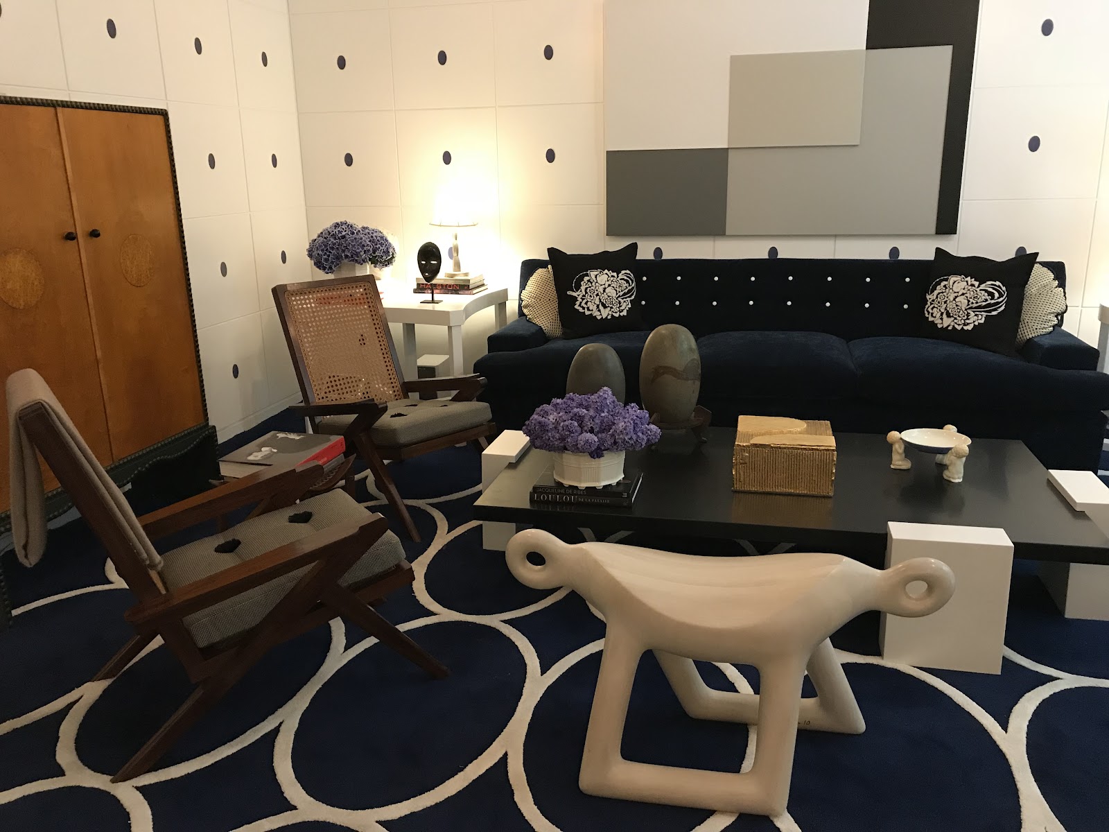
The story here, according to Montoya is inspired by 1903 and the Wiener Werkstadt in Austria, with pieces dating to that era, and artwork done by Montoya. Montoya calls the space "Moonlight” with lots of different shaped items - furniture and modular coffee table pieces grouped together that reminded me of the wood stumps used for children’s storytelling.
Even the blue and white rugs are punctuated with egg-like shapes.
I liked the floating table that I first mistook for silver angels but then, upon closer inspection, discovered was silver crocodiles and their hapless victims (ergo the body parts). I love this kind of whimsical furniture piece.

There is a garden here just beyond French doors.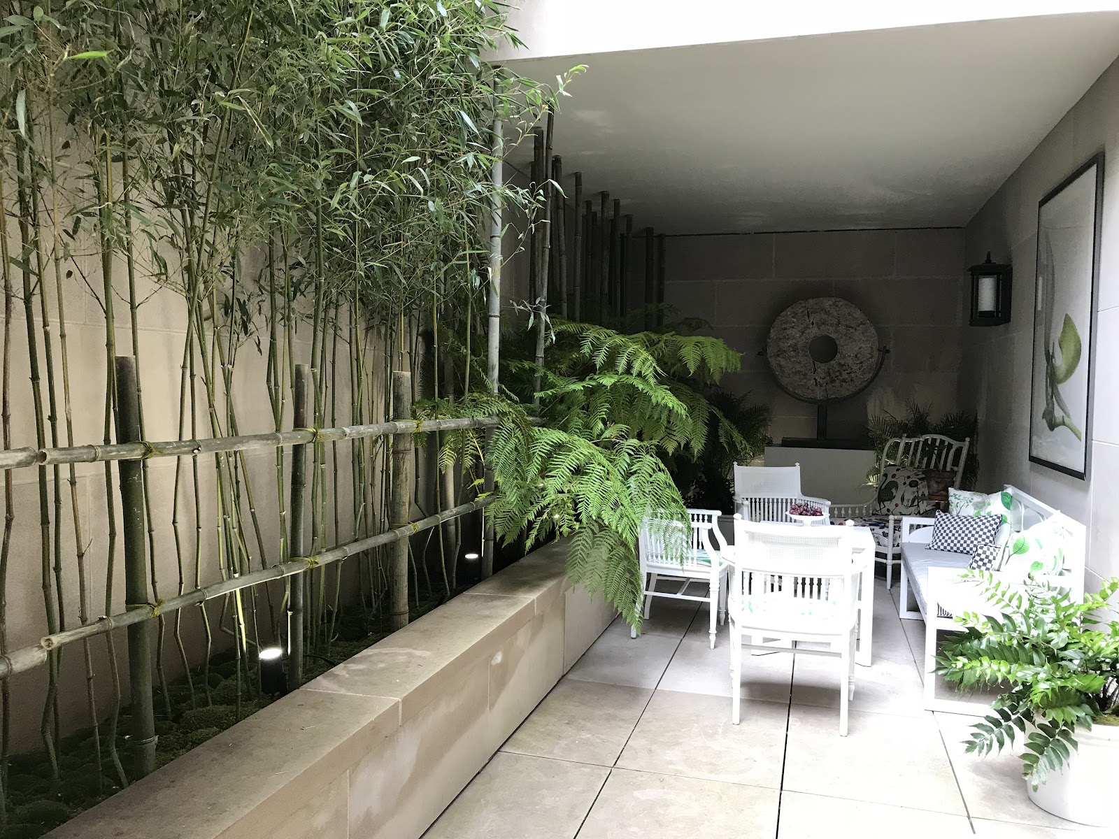
The severe rectangular space with no light is overcome with simple, clean lines, art, a wall of Tasmanian tree ferns to create a cool, neat-looking oasis with an assist from white table, chairs, and bar cart.

And Art.
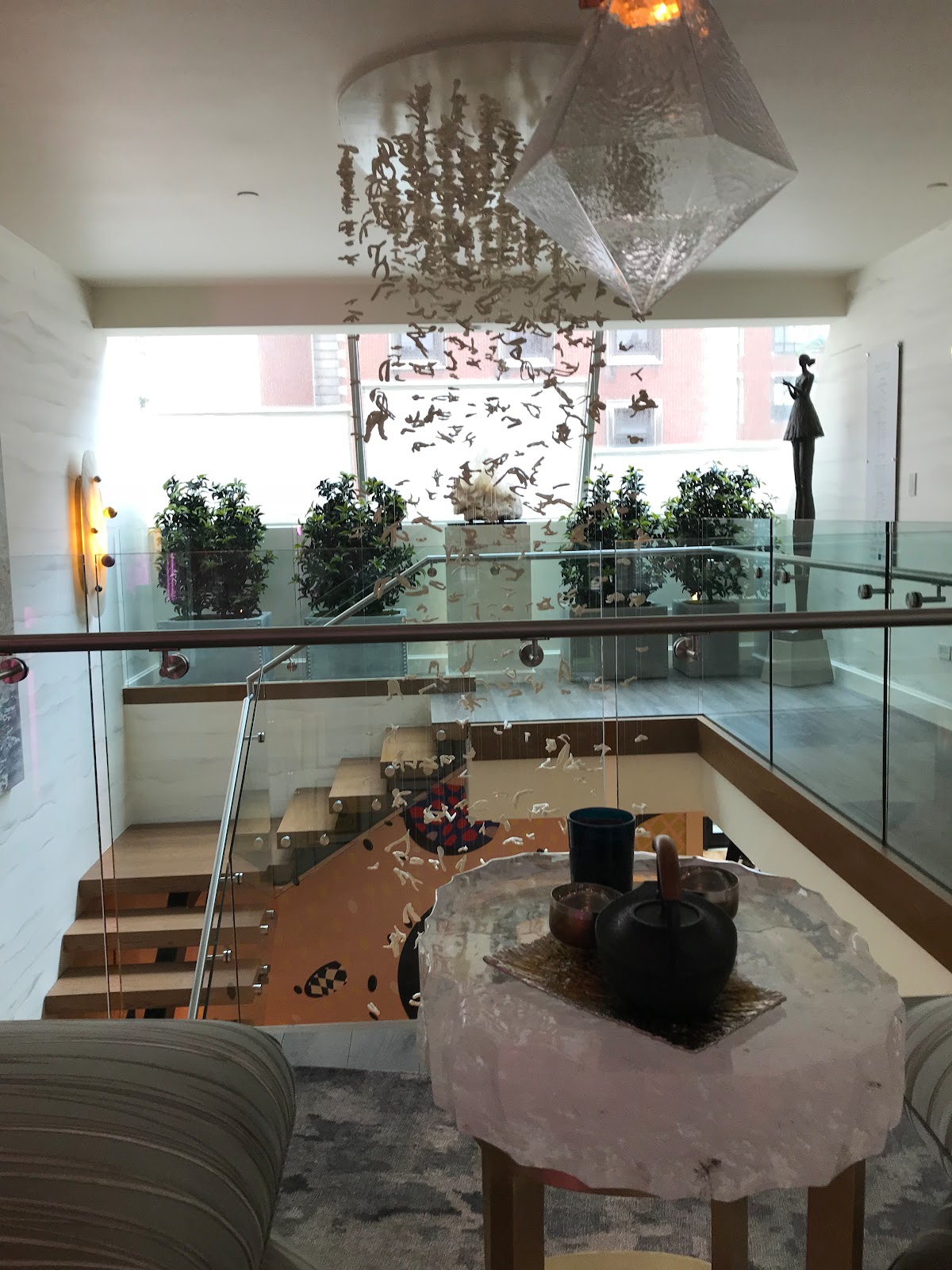
Back upstairs on the entrance and “Garden Floor” we walked through the Dan Fink Design Studio Gallery Stair.

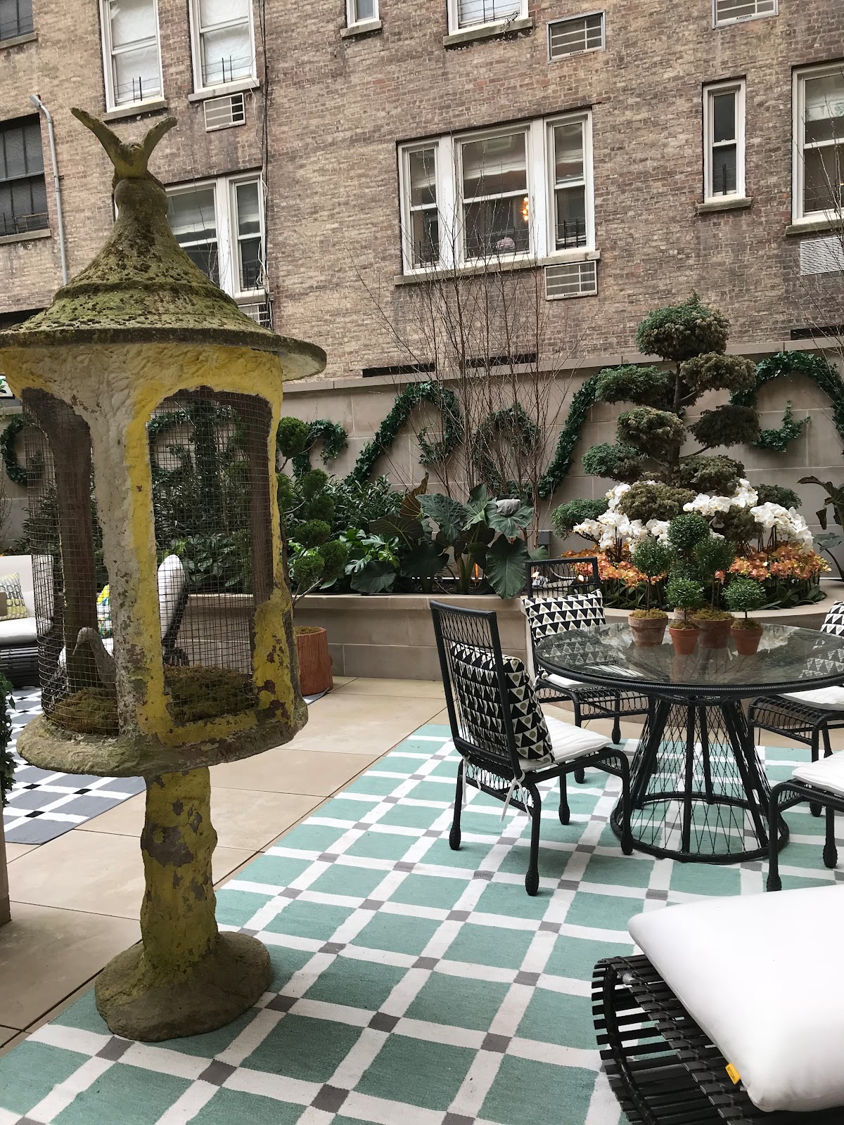
Out to the Nievera Williams Designed garden terrace as seen from the kitchen and sitting area. It’s like walking in a dream through the French doors onto the terrace...
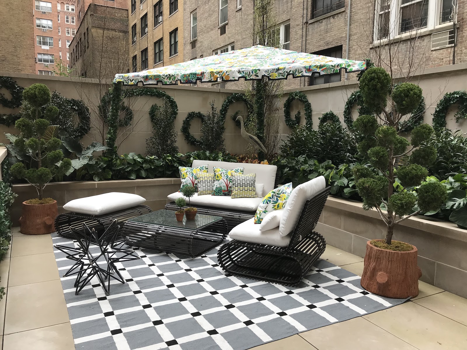
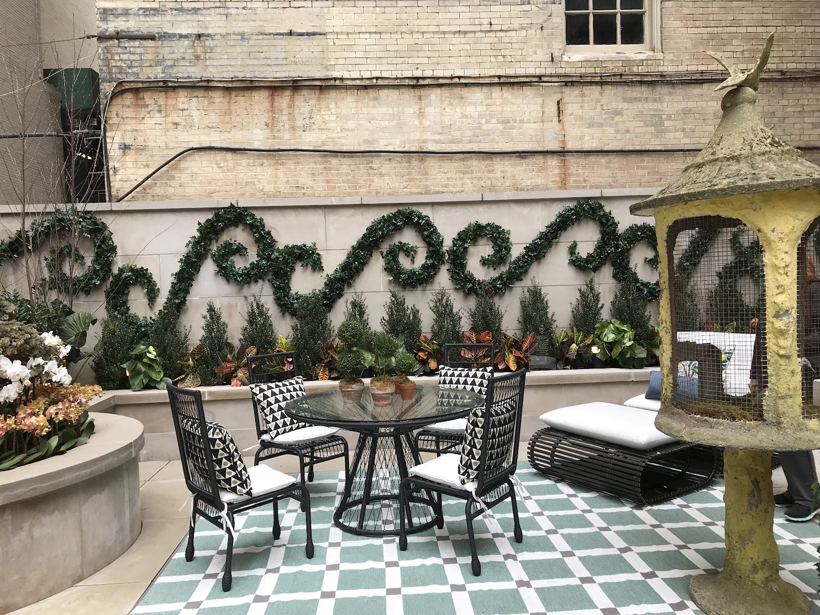
Look at the balance and scale. Essentially, there are two garden “rooms” here punctuated by the similarly-patterned but different rugs; a dining table and sitting or lounging area perfect for a summer cocktail party. The design maximizes the rooftop garden’s L-shape to offer plentiful seating, flow, and of course, plants, including topiary. The green curly-cues and the antique aviary, in particular, tickle your fancy.
The umbrella is a trapezoid shape. I never got the answer as to whether it was customized or adapted. Regardless, I think you could make this from a square umbrella if you have a corner spot needing shade.
The landscape, designer, Nievera Williams, who I’ve had the great fortune to meet in person and get his autograph for my copy of his book, Forever Green” when he was a featured host at Pennoyer & Newman’s “What’s New, What’s Next” at the annual NY Design Center.
For the Kips Bay showhouse, Williams said he collaborated with Schumacher to “come upon their ‘Citrus Garden’ pattern originally designed by Josef Frank in 1947. ‘Citrus Garden’ complements was the inspiration for the garden design’s organic, ‘accidental’ design of the space.

The staircase. Ah yes, the staircase… In my experience covering the Kips Bay Decorator Showhouse, this space is a source of challenge and befuddlement but in the end - usually ends up almost stealing the show. Back in 2014, it was designer John Douglas Eason who wrapped us around his design pinky - while wrapping the walls with a sinuous design embrace.
This year proved no different. All were agog at designer Sasha Bikoff and her spiral sensation. Bikoff - in her vintage Courreges leather sky blue jacket

was beaming as she explained the concept for the fun, Memphis Milano-inspired look. She juxtaposed a “1980’s Miami design movement with the Old World European traditional architecture of the showhouse.” The one-two, sock-it-to-me power punch of zig-zags, polka dots, squiggles and triangles creates visual eye candy and a sense of movement as you traverse the stairwell. Bikoff added, “You just want to dance on the stairs.”
I saw what she was getting at.


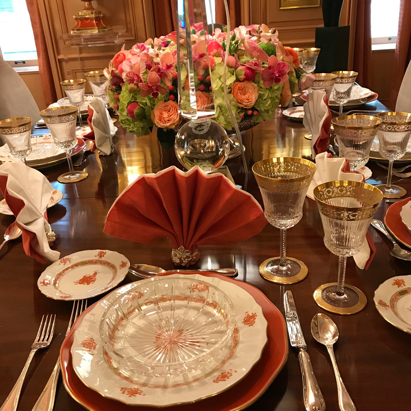
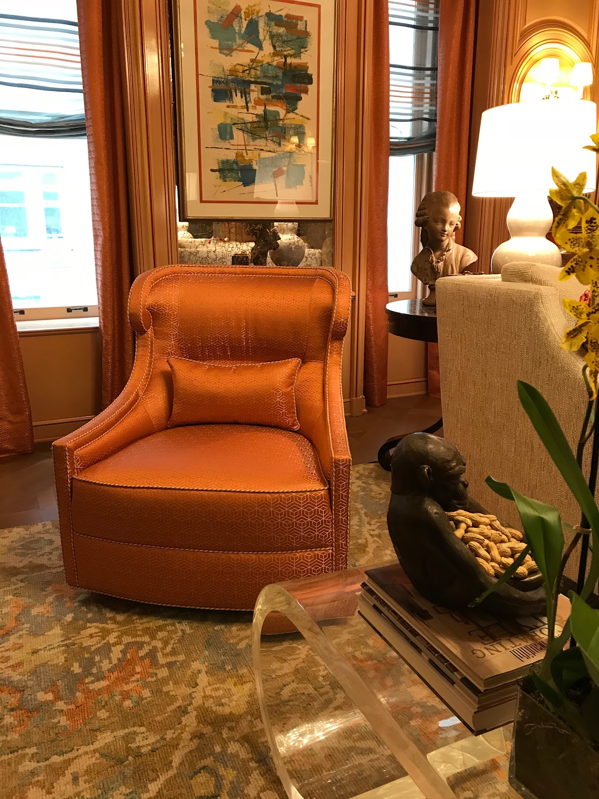
Entering the Barbara Ostrom designed “Art and A La Carte” room is like gliding into elegance. The designer claims she decided to transform the room into “the vivid sense of color and excitement I felt when viewing a great painting.” Indeed.
Given my passion for the art of tablescaping, I especially loved this room. Here, there is art-plus: literary, fine art paintings, culinary art, and a dining space that according to Ostrom, …”encourages discussions on the latest in books, theater, and progressive ideas.” That’s dramatic sophistication. In addition, check out the rainbow-inspired ceiling. More design in that “fifth wall.” Don’t overlook this design element.
The Decorator Showhouse offered a number of stellar examples of a well-designed fifth wall that makes you “look up.”

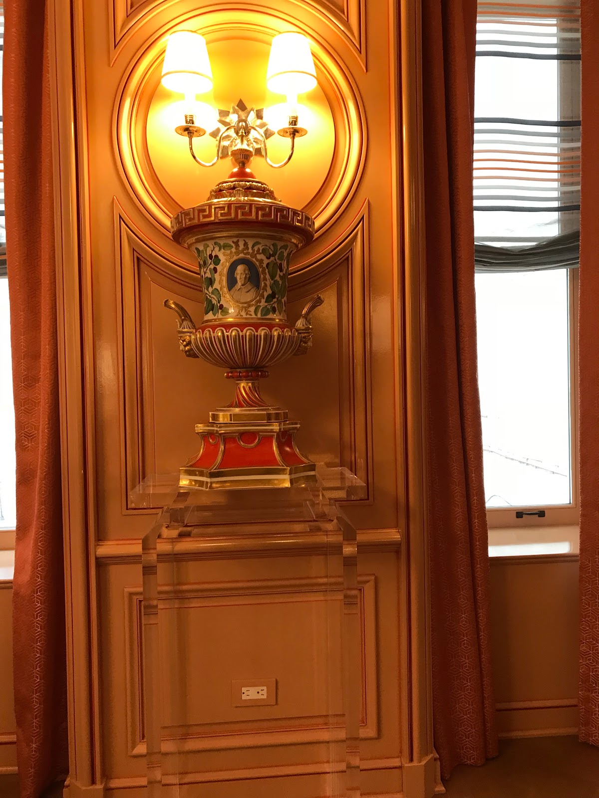
I loved the saffron or Hermes-orange-hued room and table accessories: Hungarian Herend - dinnerware was exquisite - dazzling a resonant undertone of gold present in the lighting, the shimmer of the glossy walls, and the gold-rimmed Saint Louis glassware -- the oldest European maker.

I’m just crazy for the look of lucite and have been adding pieces to my own home design. Here, Ostrom uses the lucite in a way that juxtaposes the “ghost” lucite column against the traditional look of the room’s furnishings, topped by a cinnabar urn to to a brilliant finish!
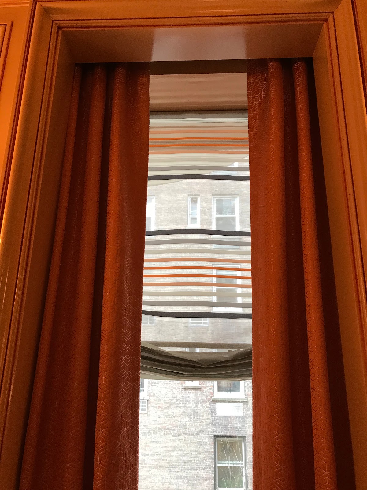
Look at the detail in the window treatments both in terms of color and style.
The Poussin inspired 17th Century wallpaper by Iksel Decorative Arts adorns the walls with bucolic landscapes; amplified by the mirrors. The antique bachelor chests stand sentinel-like on either side of the room, further performing as a palette for objects d’art.
Keeping with this year’s trend of employing Art, Herold placed Joan Miro lithographs low, atop the chests for a modern juxtaposition to the classic look to create a marvelous sense of balance.
Too often underused, Roman shades (I had a devil of a time getting a seamstress to make mine) mark the two windows here with a Schumacher silk, cloud-patterned fabric that allows natural light in. I use my flower-bordered Roman shades as a kind of scrim - allowing light in yet one can see out to the garden just beyond…
Finally, Herold embellished the walls and ceiling with gold leaf fixtures to add layered depth.
A nice detail is the Jo Malone Lime Basil & Mandarin scent surround diffusers that added a sensual element to this room’s’ comings and goings. I love this brand of fragrances and their heady, natural botanicals - the Mimosa & Cardamom is one of my signature fragrances…
We walked downstairs next to the Juan Montoya Design. It’s an expansive living room with sweeping good looks.
The story here, according to Montoya is inspired by 1903 and the Wiener Werkstadt in Austria, with pieces dating to that era, and artwork done by Montoya. Montoya calls the space "Moonlight” with lots of different shaped items - furniture and modular coffee table pieces grouped together that reminded me of the wood stumps used for children’s storytelling.
Even the blue and white rugs are punctuated with egg-like shapes.
I liked the floating table that I first mistook for silver angels but then, upon closer inspection, discovered was silver crocodiles and their hapless victims (ergo the body parts). I love this kind of whimsical furniture piece.
There is a garden here just beyond French doors.
The severe rectangular space with no light is overcome with simple, clean lines, art, a wall of Tasmanian tree ferns to create a cool, neat-looking oasis with an assist from white table, chairs, and bar cart.
And Art.
Back upstairs on the entrance and “Garden Floor” we walked through the Dan Fink Design Studio Gallery Stair.
Out to the Nievera Williams Designed garden terrace as seen from the kitchen and sitting area. It’s like walking in a dream through the French doors onto the terrace...
Look at the balance and scale. Essentially, there are two garden “rooms” here punctuated by the similarly-patterned but different rugs; a dining table and sitting or lounging area perfect for a summer cocktail party. The design maximizes the rooftop garden’s L-shape to offer plentiful seating, flow, and of course, plants, including topiary. The green curly-cues and the antique aviary, in particular, tickle your fancy.
The umbrella is a trapezoid shape. I never got the answer as to whether it was customized or adapted. Regardless, I think you could make this from a square umbrella if you have a corner spot needing shade.
The landscape, designer, Nievera Williams, who I’ve had the great fortune to meet in person and get his autograph for my copy of his book, Forever Green” when he was a featured host at Pennoyer & Newman’s “What’s New, What’s Next” at the annual NY Design Center.
For the Kips Bay showhouse, Williams said he collaborated with Schumacher to “come upon their ‘Citrus Garden’ pattern originally designed by Josef Frank in 1947. ‘Citrus Garden’ complements was the inspiration for the garden design’s organic, ‘accidental’ design of the space.
The staircase. Ah yes, the staircase… In my experience covering the Kips Bay Decorator Showhouse, this space is a source of challenge and befuddlement but in the end - usually ends up almost stealing the show. Back in 2014, it was designer John Douglas Eason who wrapped us around his design pinky - while wrapping the walls with a sinuous design embrace.
This year proved no different. All were agog at designer Sasha Bikoff and her spiral sensation. Bikoff - in her vintage Courreges leather sky blue jacket
was beaming as she explained the concept for the fun, Memphis Milano-inspired look. She juxtaposed a “1980’s Miami design movement with the Old World European traditional architecture of the showhouse.” The one-two, sock-it-to-me power punch of zig-zags, polka dots, squiggles and triangles creates visual eye candy and a sense of movement as you traverse the stairwell. Bikoff added, “You just want to dance on the stairs.”
I saw what she was getting at.
Entering the Barbara Ostrom designed “Art and A La Carte” room is like gliding into elegance. The designer claims she decided to transform the room into “the vivid sense of color and excitement I felt when viewing a great painting.” Indeed.
Given my passion for the art of tablescaping, I especially loved this room. Here, there is art-plus: literary, fine art paintings, culinary art, and a dining space that according to Ostrom, …”encourages discussions on the latest in books, theater, and progressive ideas.” That’s dramatic sophistication. In addition, check out the rainbow-inspired ceiling. More design in that “fifth wall.” Don’t overlook this design element.
The Decorator Showhouse offered a number of stellar examples of a well-designed fifth wall that makes you “look up.”
I loved the saffron or Hermes-orange-hued room and table accessories: Hungarian Herend - dinnerware was exquisite - dazzling a resonant undertone of gold present in the lighting, the shimmer of the glossy walls, and the gold-rimmed Saint Louis glassware -- the oldest European maker.
I’m just crazy for the look of lucite and have been adding pieces to my own home design. Here, Ostrom uses the lucite in a way that juxtaposes the “ghost” lucite column against the traditional look of the room’s furnishings, topped by a cinnabar urn to to a brilliant finish!
Look at the detail in the window treatments both in terms of color and style.
The inside roman shade is a gauzy crayon-colored lines and the long, floor-length drapes style the mandarin sherbert colored glossy walls. Lots of layered texture here. In the dining room and the sitting area of the library as well.
Grey is my new favorite color and it just swept me off my feet to see it paired up with the sherbert and cinnabar color here. Very unexpected and yet sophisticated.

Bravo!
Grey is my new favorite color and it just swept me off my feet to see it paired up with the sherbert and cinnabar color here. Very unexpected and yet sophisticated.
Bravo!
The Brian del Toro designed bedroom could be my favorite -- its artful, layered composition is a tour-de force: compelling and enduring. And so livable. I didn’t want to leave.
It was explained that del Toro began his design with a great find: a hand-painted Robert Chowder screen from the 1960’s - adorned with birds and flowers - with a soft, pale green the takeaway color.


The room’s color scheme is that pale green, accented with taupes and pale pinks for a completely soothing sensation. See how the designer fluttered the bird motif from the classic screen to the bed linen pillows.

Textures reign! Consider shagreen chests of drawers, (designed by Alexander Lamont) -- the randomly-placed acrylic knobs glamorously reflect the light.
Innovations papered cork with gold accents on the fifth wall/ceiling,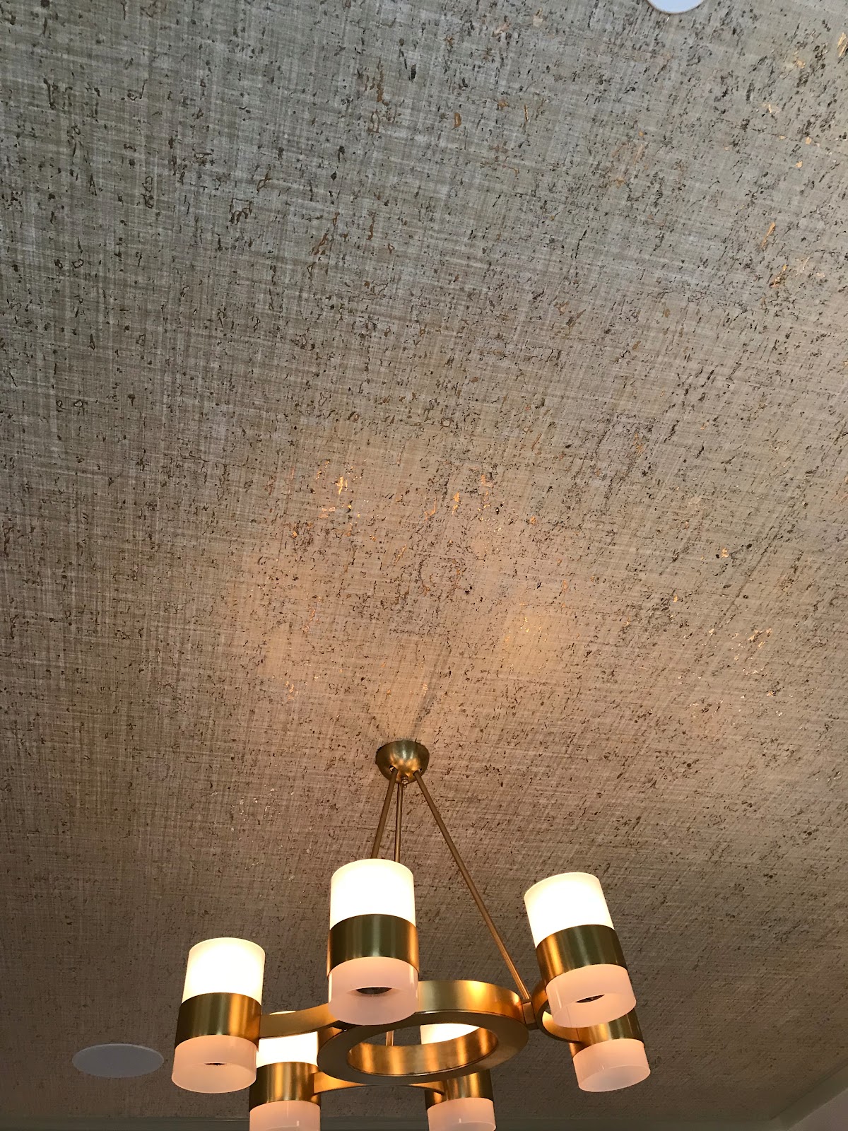
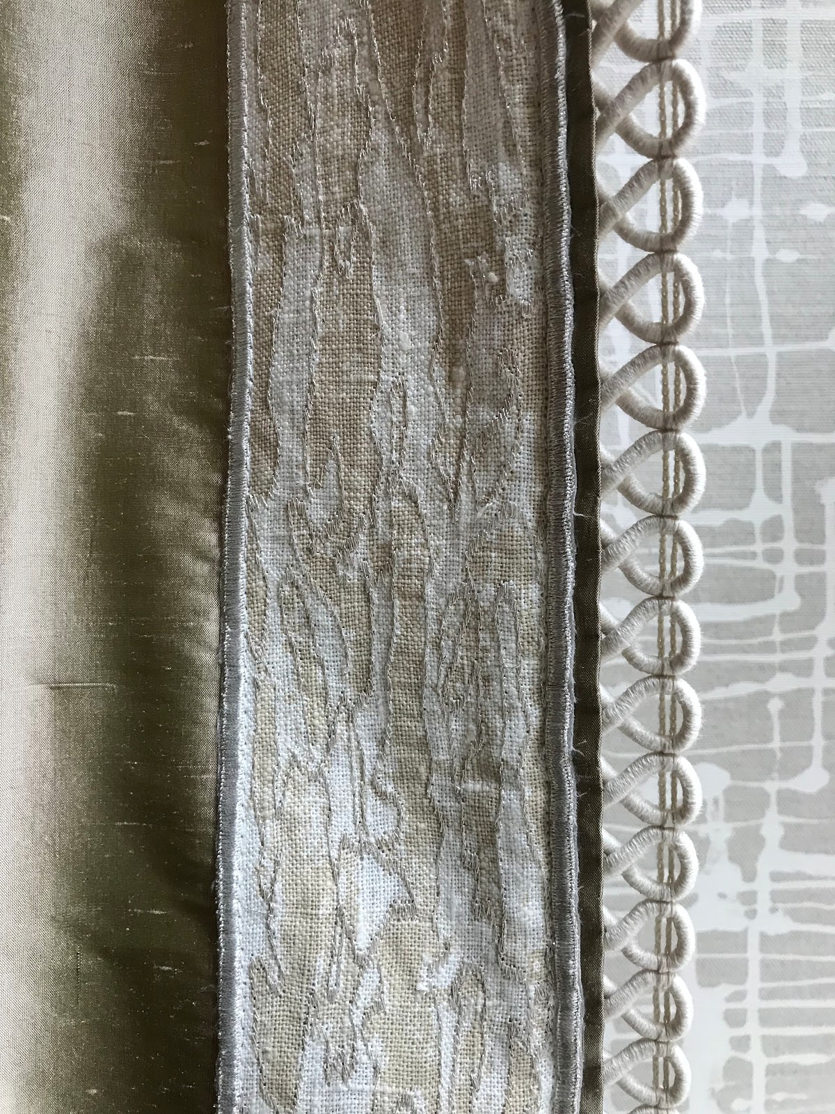
linen-like fabric graphic walls from Quadrille, and the shimmery, silk curtain fabric are pure ball gowns - whispering the green, pink and neutrals of the room.

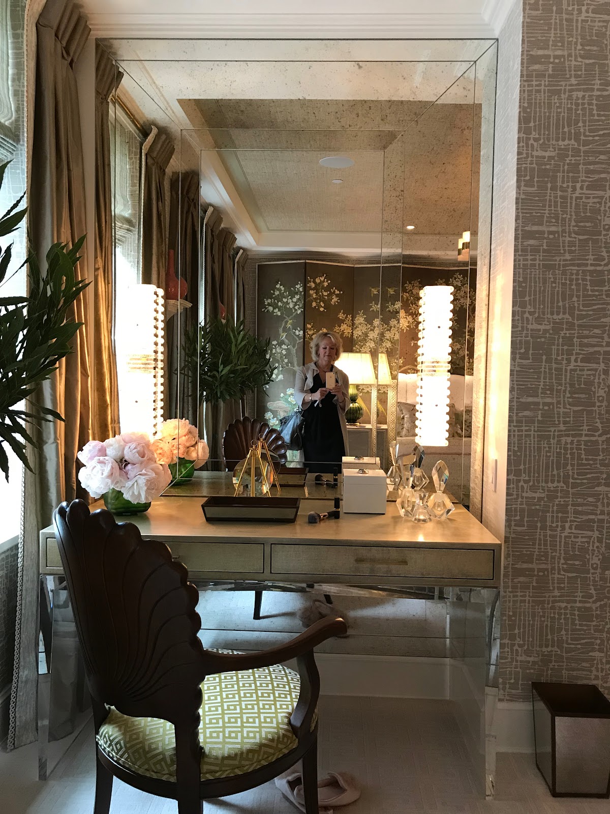
The designer employed an acrylic-legged dressing table for more of my favorite “ghost furniture” glamour - especially as it sits against an antiqued glass inset panel design by del Toro.
Details matter. To whit, del Toro extended the greens in the vestibule with a Farrow & Ball wallpaper - which he hung upside down -- “to create a naturalist reference back to the floral screen,” according to del Toro.
This is a very peaceful, restorative boudoir.
Branca -- Alessandra Branca - designed the master suite; recasting the room into a “sunshine” space. The lucite/plexi-glass and brass bed shimmers. American raffia grasscloth by Phillip Jeffries is a star of the mixed media here: the white wool carpet, an inlaid ivory cabinet and bench; lacquer,
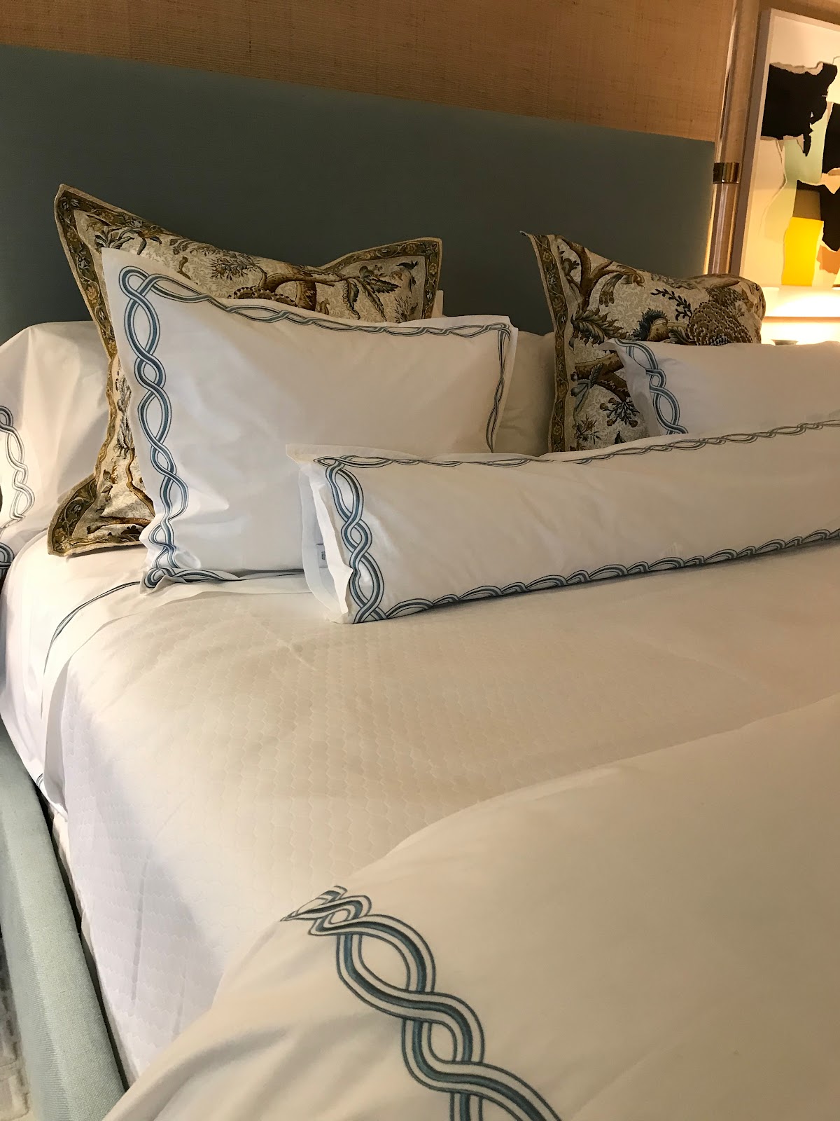
and her cool as the ocean bed linens from the designers’ signature Casa Branca Collection for Sferra. I want these...


The sitting area incorporates that sunshine yellow with the cool-blue accented with the Tina Barney landscape photograph.


The “living wall” in the Marcia Tucker designed Master Bathroom bathroom is a lush eye-appealing retreat that is both bold, yet peaceful. The focal point of the sanctuary is from Magnaflora Design and Mauro Gomes is the floral designer. As a horticulturist, I’m often skeptical about the maintenance of this kind of envy-inducing green walls. The interior gardener putting the finishing touches on the wall, explained how it works and was quite positive on its durability; while agreeing that it does take maintenance -- which the company provides.
It sure is transporting to take a spa bath with a kind of jungle wall peeking next to you.

As a doyenne of cocktail culture, I really took to the Wet Bar, designed by Wesly Moon. There is in fact three “rooms” here: the Wet Bar, the Butler’s Pantry, and the Elevator Landing.

The Wet Bar is darkly glamorous - the lighting effect creates a kind of come-hither glow. The countertop and back wall are covered in a dark Belgian Bluestone.
The astonishing wallpaper was designed by Moon -- it’s a digital murals based inspired by the “medieval hymnals from the Metropolitan Museum of Art.”
The flower and leaf, textured Eglomise glasses are on full-frontal display and are works of art themselves, enhanced by the lighting.
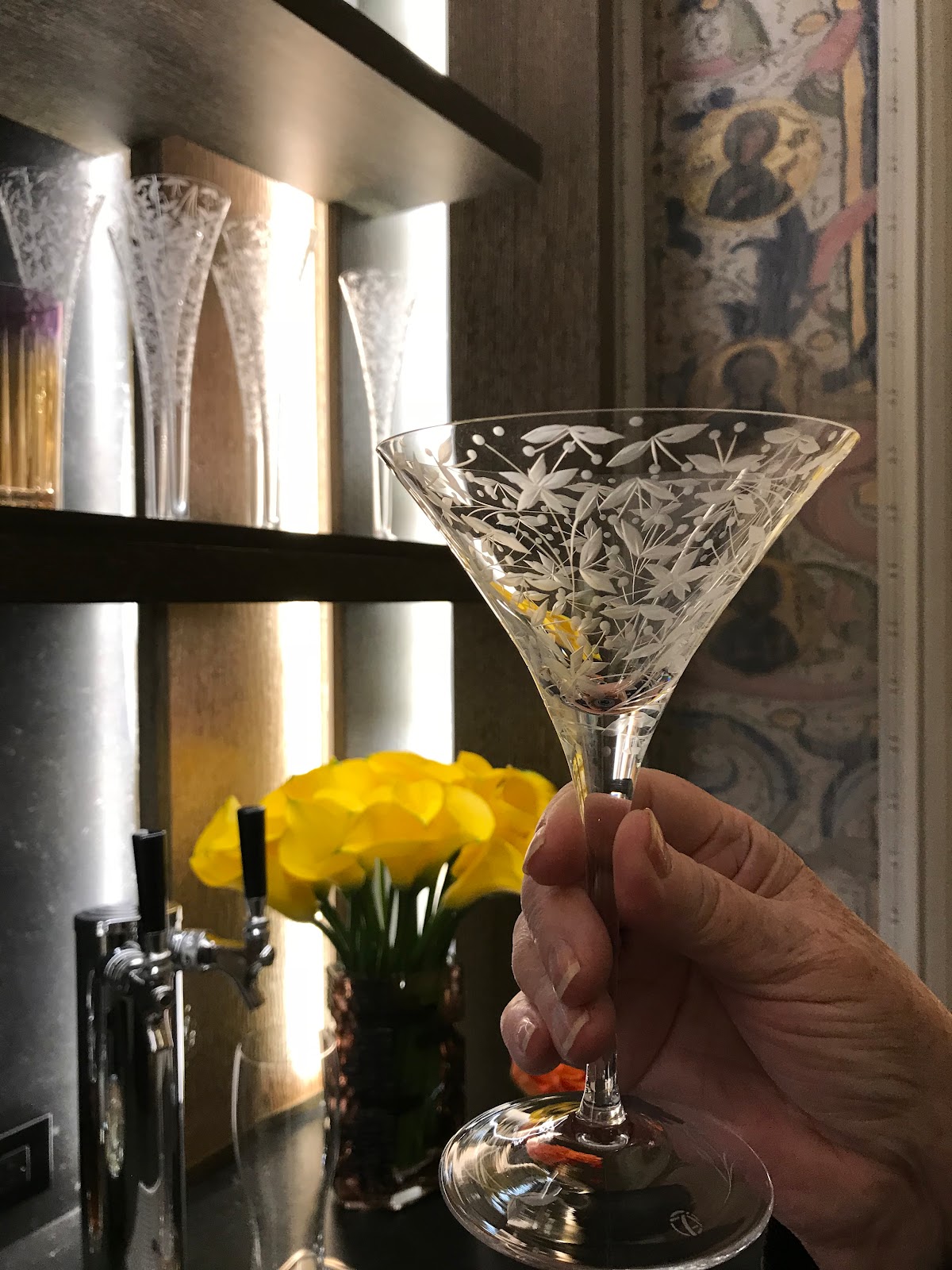

Look up: the ceiling light fixture is also a work of art:
The Landing is highlighted by a kind of “sitting pod” - which is a contemporary bronze bench from Wexler Gallery.
The walls are gold paper in a customized de Gournay and the ceiling/fifth wall is covered in a bespoke paper by Holland & Sherry. I dare you to take your eyes off that Bill Cunningham big, feathered mirror the designer spied at Jonathan Burden

The top floor is a welcome surprise - and a complete retreat. A spa or as designer Pavarini describes it, a “Home Wellness Retreat for Mind, Body, and Spirit.”
I’m all in.
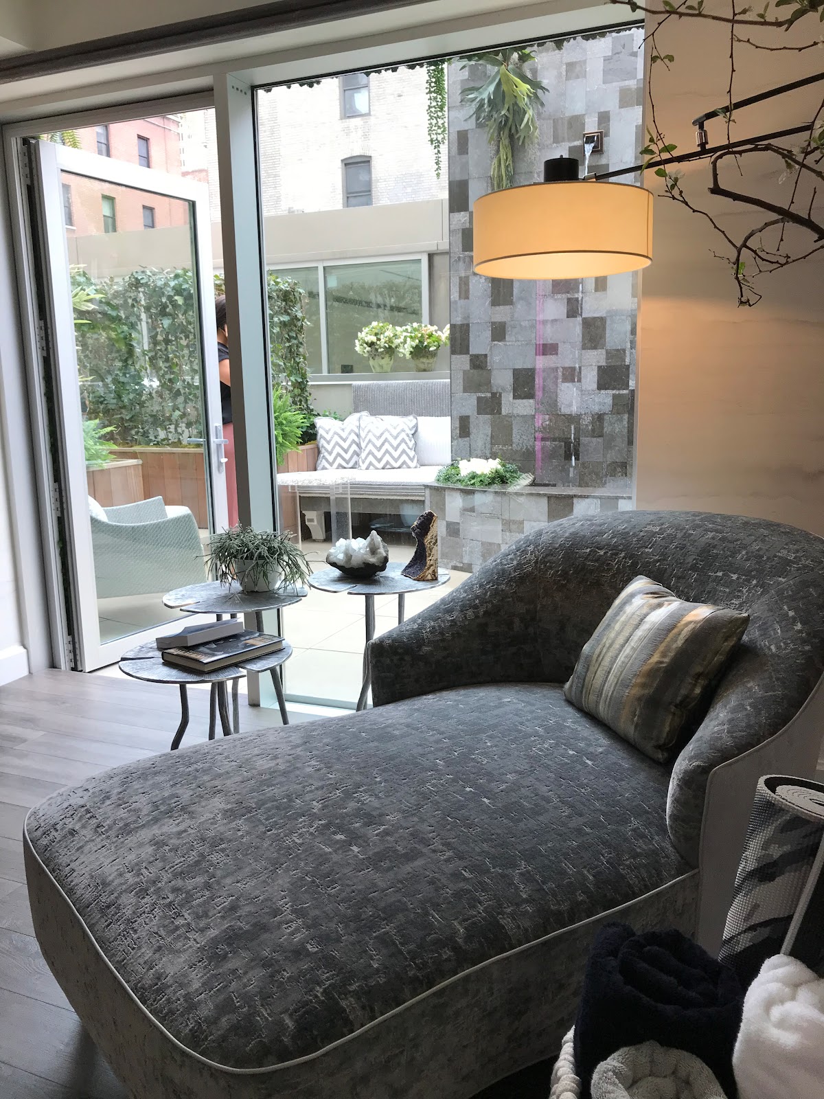
This design possesses so many elements: there are spaces for meditation, yoga, massage, relaxing. The color wheel is dialed up to cool greys and silver, along with gold.
And green - as seen in the outdoor/rooftop fountain and garden and cafe sitting area.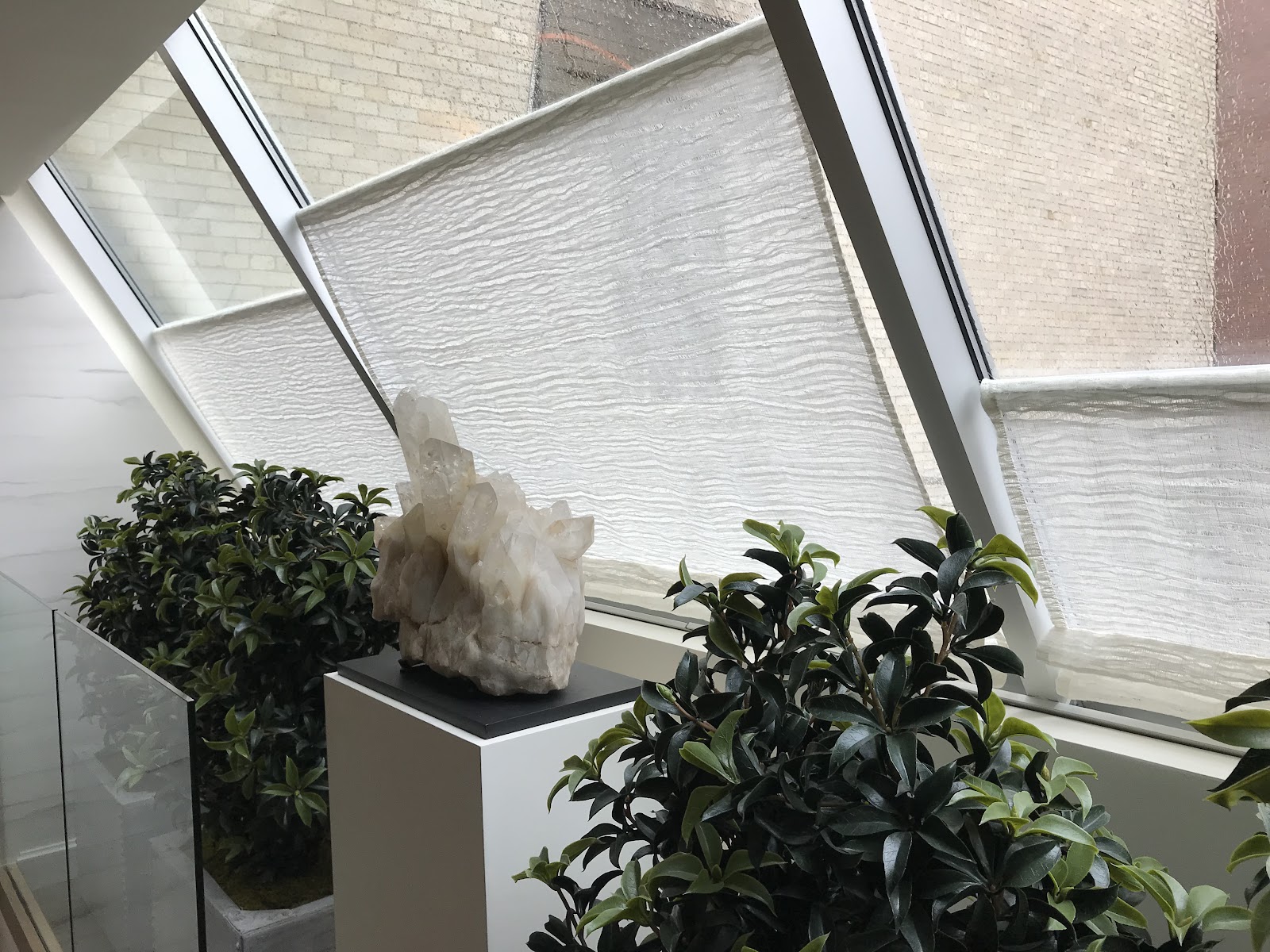


The indoor space envelops you in texture: glass, that reflective and glamorous lucite; metals -- there is a beaded curtain separating the massage table from a sitting area.

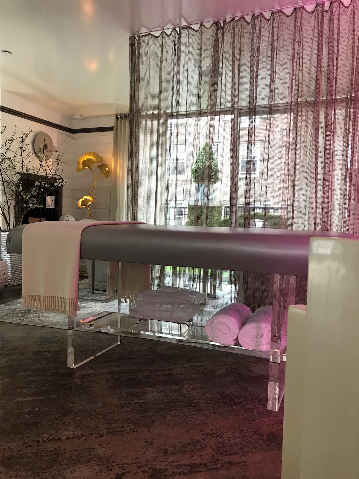

And a hammered sink, art, and crystal, all bring a sense of harmony and luxury to this extraordinary room. The subtle colored lighting illuminates the crystal wall insets.
One last nod to pure glamour -- the Drake/Anderson Master Sitting Room. Wowsy. Where to look first… The sexy, sinuous, saffron velvet sofa is a swoon-worthy place to start.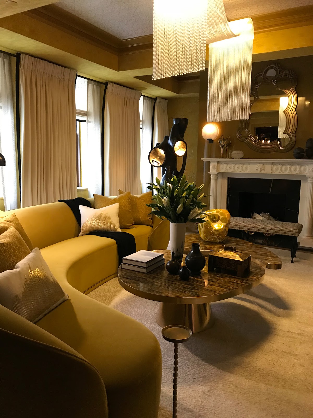
The custom Mathieu Lustrerie chandelier is heart-clutching.
And speaking of shimmering, even the walls are covered in a hand sewn beads and sequins by Ankasa on a Lelievre fabric that like an exotic dancer, wend their way along the upholstered walls. You can’t take your eyes away…
Except maybe to look at the asymmetrical cocktail tables in brass and tiger’s eye that accessorize the ochre colored sofa and walls.
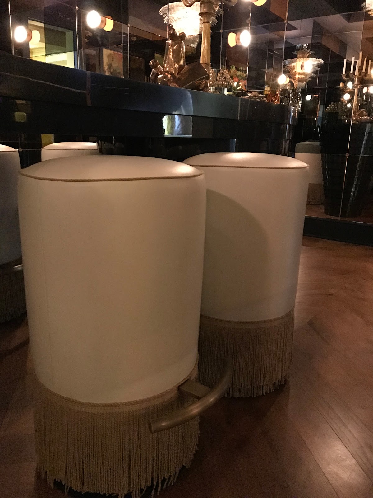
And just when you think it can’t get any better, you walk - trance-like - to the room next to the sitting room only to discover a sophisticated, shimmering jewel-box of a bar.
This is something right out of the cinema.
The wrap-around is encased in smoke, gold, and clear mirrors.
The bar itself is designed by Drake/Anderson; a five-tier Murano glass chandelier hangs overhead and tall, ochre pouf bar stools, complete with kick plates - right above the showgirl fringe, anoint the bar.
Thank you, Kips Bay, for another superlative, inspiring show.
Be sure to stop by for a design retreat. You have till the end of the month to take it all in.
You can revisit, too as there really is so much to see. Tickets are available on site or go to the Kips Bay website.
Cheers to all that glamour and talent.

The room’s color scheme is that pale green, accented with taupes and pale pinks for a completely soothing sensation. See how the designer fluttered the bird motif from the classic screen to the bed linen pillows.
Textures reign! Consider shagreen chests of drawers, (designed by Alexander Lamont) -- the randomly-placed acrylic knobs glamorously reflect the light.
Innovations papered cork with gold accents on the fifth wall/ceiling,
linen-like fabric graphic walls from Quadrille, and the shimmery, silk curtain fabric are pure ball gowns - whispering the green, pink and neutrals of the room.
The designer employed an acrylic-legged dressing table for more of my favorite “ghost furniture” glamour - especially as it sits against an antiqued glass inset panel design by del Toro.
Details matter. To whit, del Toro extended the greens in the vestibule with a Farrow & Ball wallpaper - which he hung upside down -- “to create a naturalist reference back to the floral screen,” according to del Toro.
This is a very peaceful, restorative boudoir.
Branca -- Alessandra Branca - designed the master suite; recasting the room into a “sunshine” space. The lucite/plexi-glass and brass bed shimmers. American raffia grasscloth by Phillip Jeffries is a star of the mixed media here: the white wool carpet, an inlaid ivory cabinet and bench; lacquer,
and her cool as the ocean bed linens from the designers’ signature Casa Branca Collection for Sferra. I want these...
The sitting area incorporates that sunshine yellow with the cool-blue accented with the Tina Barney landscape photograph.

The “living wall” in the Marcia Tucker designed Master Bathroom bathroom is a lush eye-appealing retreat that is both bold, yet peaceful. The focal point of the sanctuary is from Magnaflora Design and Mauro Gomes is the floral designer. As a horticulturist, I’m often skeptical about the maintenance of this kind of envy-inducing green walls. The interior gardener putting the finishing touches on the wall, explained how it works and was quite positive on its durability; while agreeing that it does take maintenance -- which the company provides.
It sure is transporting to take a spa bath with a kind of jungle wall peeking next to you.
As a doyenne of cocktail culture, I really took to the Wet Bar, designed by Wesly Moon. There is in fact three “rooms” here: the Wet Bar, the Butler’s Pantry, and the Elevator Landing.
The Wet Bar is darkly glamorous - the lighting effect creates a kind of come-hither glow. The countertop and back wall are covered in a dark Belgian Bluestone.
The astonishing wallpaper was designed by Moon -- it’s a digital murals based inspired by the “medieval hymnals from the Metropolitan Museum of Art.”
The flower and leaf, textured Eglomise glasses are on full-frontal display and are works of art themselves, enhanced by the lighting.
Look up: the ceiling light fixture is also a work of art:
The Landing is highlighted by a kind of “sitting pod” - which is a contemporary bronze bench from Wexler Gallery.
The walls are gold paper in a customized de Gournay and the ceiling/fifth wall is covered in a bespoke paper by Holland & Sherry. I dare you to take your eyes off that Bill Cunningham big, feathered mirror the designer spied at Jonathan Burden
The top floor is a welcome surprise - and a complete retreat. A spa or as designer Pavarini describes it, a “Home Wellness Retreat for Mind, Body, and Spirit.”
I’m all in.
This design possesses so many elements: there are spaces for meditation, yoga, massage, relaxing. The color wheel is dialed up to cool greys and silver, along with gold.
And green - as seen in the outdoor/rooftop fountain and garden and cafe sitting area.
The indoor space envelops you in texture: glass, that reflective and glamorous lucite; metals -- there is a beaded curtain separating the massage table from a sitting area.
And a hammered sink, art, and crystal, all bring a sense of harmony and luxury to this extraordinary room. The subtle colored lighting illuminates the crystal wall insets.
One last nod to pure glamour -- the Drake/Anderson Master Sitting Room. Wowsy. Where to look first… The sexy, sinuous, saffron velvet sofa is a swoon-worthy place to start.
The custom Mathieu Lustrerie chandelier is heart-clutching.
And speaking of shimmering, even the walls are covered in a hand sewn beads and sequins by Ankasa on a Lelievre fabric that like an exotic dancer, wend their way along the upholstered walls. You can’t take your eyes away…
Except maybe to look at the asymmetrical cocktail tables in brass and tiger’s eye that accessorize the ochre colored sofa and walls.
And just when you think it can’t get any better, you walk - trance-like - to the room next to the sitting room only to discover a sophisticated, shimmering jewel-box of a bar.
This is something right out of the cinema.
The wrap-around is encased in smoke, gold, and clear mirrors.
The bar itself is designed by Drake/Anderson; a five-tier Murano glass chandelier hangs overhead and tall, ochre pouf bar stools, complete with kick plates - right above the showgirl fringe, anoint the bar.
Thank you, Kips Bay, for another superlative, inspiring show.
Be sure to stop by for a design retreat. You have till the end of the month to take it all in.
You can revisit, too as there really is so much to see. Tickets are available on site or go to the Kips Bay website.
Cheers to all that glamour and talent.


No comments:
Post a Comment