Memorial Day is a true red, white, and blue American holiday. Let’s stick with that true part and celebrate and honor the men and women who died while serving in the U.S. military.
Originally known as Decoration Day, it originated in the years following the Civil War yet only became an official federal holiday in 1971.
Given that historical foundation, I thought it’d be appropriate - and fun -- to pay homage to the brave service people while emphasizing the Decoration Day pedigree -- that means serving up cocktails with fabulous Finishing Touches garnishes as drink “decoration,” while imbibing some vintage Atomic Age cocktails from 1970’s America - all the while accommodating what Memorial Day has also embraced: the official kick off to summer. And that means parties: pool parties, beach parties, terrace parties, and well, as much of the outdoor love as you can toast to. And to our brave service people. My husband Bill - and my beloved father, George are Navy. Your family?
These vintage cocktails are delicious -- and surprisingly - easy to make. But they do read rather potent!
1970’s Atomic Age Cocktails:
The Swinging 70’s cocktail culture was in no small part influenced by that quaint Playboy culture. Here’s one from the mansion’s Playboy’s Bar Guide:
Bushranger - 1971
Ingredients
1 oz. light rum
1 oz. Dubonnet
2 dashes Angostura bitters
Lemon peel
Instructions - Method
Shake rum, Dubonnet and bitters well with ice. Strain into pre-chilled cocktail glass. Twist lemon peel above drink and drop into glass.
This cocktail moniker reminded me of the Bushwacker - a drink that a favorite former boss of mine, Bob Dorf, claimed to have created (or was that apocryphal or legend...) for the client Galliano. (I must confess, I never realized how many herbs, spices, and plant extracts were distilled into this Italian liquor. Worth a revisit.
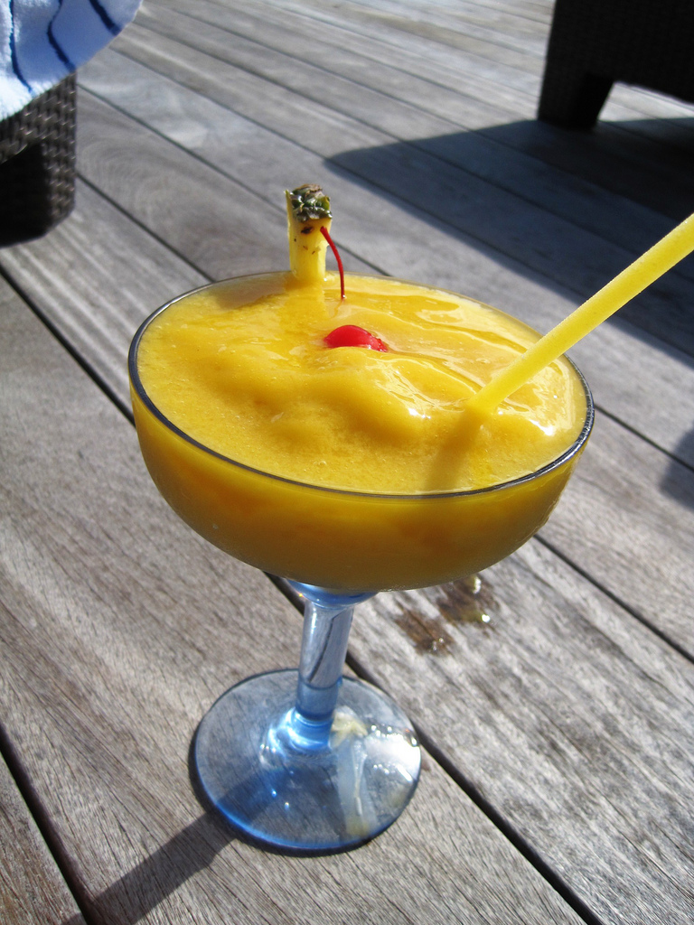
Harvey Wallbanger
Ingredients:
1 1/2 oz (3 parts) Vodka
3 oz (6 parts) fresh squeezed orange juice
1/2 oz (1 part) Galliano
This cocktail moniker reminded me of the Bushwacker - a drink that a favorite former boss of mine, Bob Dorf, claimed to have created (or was that apocryphal or legend...) for the client Galliano. (I must confess, I never realized how many herbs, spices, and plant extracts were distilled into this Italian liquor. Worth a revisit.
Harvey Wallbanger
Ingredients:
1 1/2 oz (3 parts) Vodka
3 oz (6 parts) fresh squeezed orange juice
1/2 oz (1 part) Galliano
Method:
Stir the vodka and orange juice with ice in the glass, then float the Galliano on top. Garnish and serve over ice.
Garnish:
Maraschino cherry (Luxardro or homemade) and orange slice
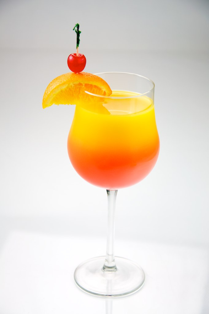
Tequila Sunrise
Ingredients:
1-1/2 ounces Blanco Tequila -- I have to recommend Casamigos or Patron - or Maestro Dobel tequila
4 – 5 ounces fresh squeezed orange juice
Grenadine
Method:
Fill a highball glass with ice. Pour in tequila and then orange juice, leaving room to top off with a float (approximately 1/2 ounce) of grenadine.
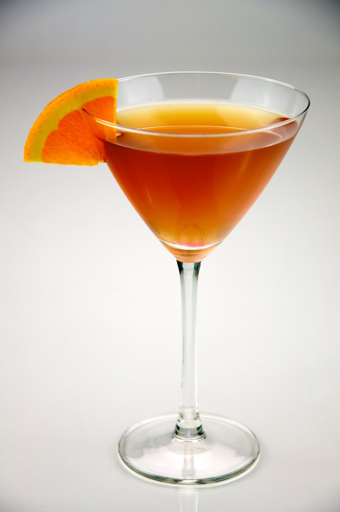
Stinger
Ingredients:
2 ounces Cognac or Brandy
1 ounce White Crème de Menthe
Stir the vodka and orange juice with ice in the glass, then float the Galliano on top. Garnish and serve over ice.
Garnish:
Maraschino cherry (Luxardro or homemade) and orange slice
Tequila Sunrise
Ingredients:
1-1/2 ounces Blanco Tequila -- I have to recommend Casamigos or Patron - or Maestro Dobel tequila
4 – 5 ounces fresh squeezed orange juice
Grenadine
Method:
Fill a highball glass with ice. Pour in tequila and then orange juice, leaving room to top off with a float (approximately 1/2 ounce) of grenadine.
Stinger
Ingredients:
2 ounces Cognac or Brandy
1 ounce White Crème de Menthe
Method:
Combine all ingredients in a cocktail shaker filled with ice. Shake well. Strain into an old-fashioned glass filled with crushed ice.
Grasshopper - Updated: This is my take on the classic from my soon to be released Finishing Touches cocktail book:
Verdant Green Jangala
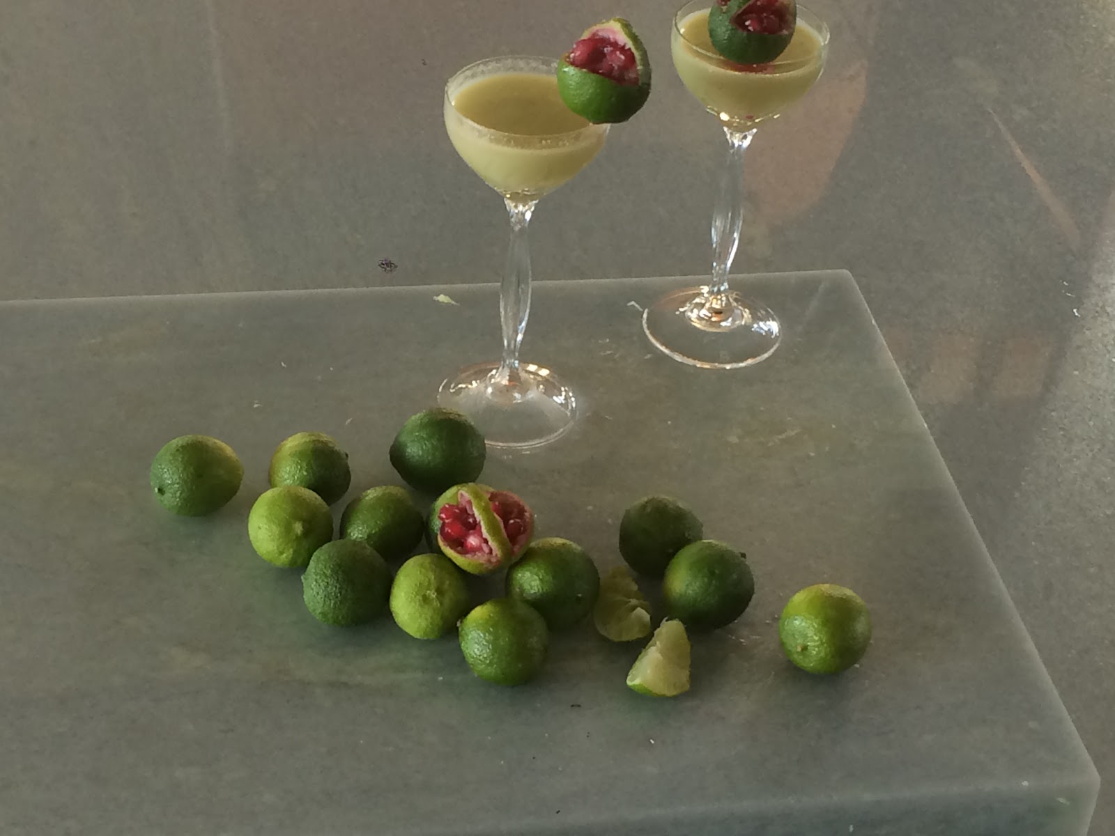
A remix on a jungle-green Grasshopper that’s refreshingly minty, and as bewitching and enchanting as nature’s world of plants. Oh, and jangala is Sanskrit for jungle.
Ingredients:
1 jigger green creme de menthe
1 jigger white creme de cocoa or white chocolate syrup - homemade is best
1 jigger milk (or cream, or cream of coconut)
3-5 shakes of Fee Brothers chocolate bitters
Method:
Mix all in shaker - with ice
Pour into ornamental stemmed cordial, liqueur or sherry glasses, straight up.
Garnish:
Key lime basket brimming with mango pieces.
Key Limes are tiny (1-2 inches); the size allows the basket to perch on the glass rim with a cut on the bottom. Or place a toothpick in the underside of the basket and perch a la a beach umbrella so that the basket rests on the rim with support. To create the garnish, use a paring knife to cut out first one side, then the other, leaving the middle strip as a “handle” You can scallop or cut notches on the edges of the “basket” if you choose. Use a serrated melon baller to hollow out the key lime pulp. Cut up pieces of colorful, soft tropical fruit -- mango or papaya -- and fill the basket. You can also fill a dollop of red pomegranate seeds.
Cocktail Composition
Arrange plants - think herbals, spice plants, and small fruit “trees” as an homage to this nature setting. Potted rosemary, lime, or any kind of mint plant - there’s apple mint, pineapple mint, and more! Continue the green theme with lime-green coasters, cocktail napkins and green snacks. I paired the chocolate green Pocky sticks in a glass for easy snacking - plus there’s a matching chocolate taste. Animal crackers add to the whimsical jungle theme.
For added jungle ambiance, lay out the smart technology tuned to nature videos. Here I used two phones and an IPad, each with its own nature show. The jungle sounds of birds singing, cascading waterfalls, and jungle cats (peering at the animal cracker still life!) is a cocktail party conversation starter and a unique, personalized cocktail composition component that can be readily adapted to any number of party themes. Engage your guests - ask them to provide a favorite video and add to the composition.
Cuba Libre - and my Finishing Touches recipe for Cuban daiquiri from my visit to Hemingway’s bar there.
Havana Daiquiri - Recipe from Havana Club
Ingredients:
2 teaspoons sugar
Juice of half a Lime
2 fresh mint sprigs
2 parts of sparkling water
1 part of Havana Club Añejo 3 Años (1 jigger/1.5 ounces or 4.5cl)
4 ice cubes
Method:
In a tall glass, add 2 teaspoons of sugar, the juice of half a lime, 2 mint sprigs and 2 parts of sparkling water (3 ounces or 9cl)
Muddle gently.
Add one part of Havana Club Añejo 3 Años and the ice cubes.
Stir well
Strain into a daquiri glass. This is a beautiful drink that is so popular it has its very own glass…
Garnish:
Cut limes to create swirling peels. Place two on glass rim, with lime just “kissing” the drink. A swirling peel can also be wrapped and speared with a cocktail pick and a sprig of fresh mint. Can also create “tatooed” lime wedges and perch on the edge of the glass. The tattoo lime wedges are made from half or quarter of a lime and cutting little “grooves” into the citrus skin. Or garnish with “tatoo” lime slices or plain lime slices tucked into the drink.
Brandy Alexander or my Finishing Touches twist on this favorite: the Open Sesame:
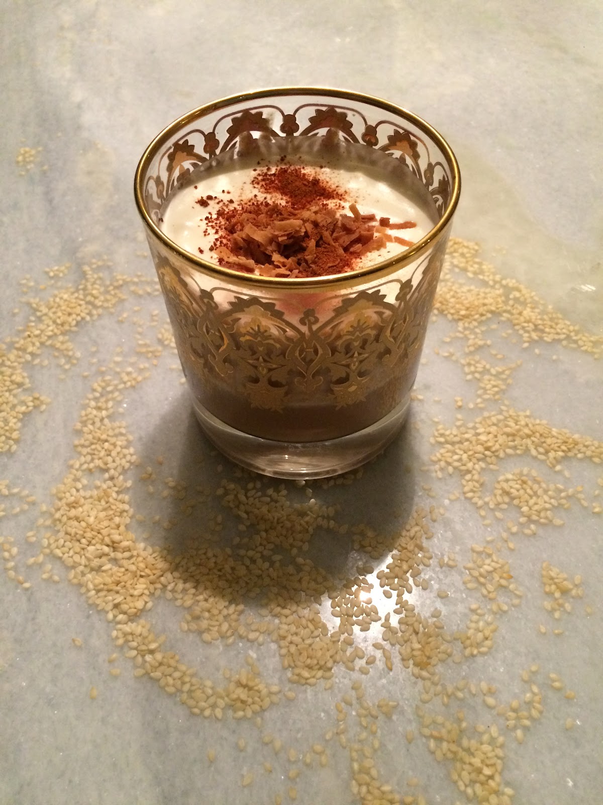
The drink was named for the phrase Open Sésame that is from Antoine Galland's novel, “Les Mille et une Nuits or “One Thousand and One Nights” -- Sésame, ouvre-toi means "Sesame, open!" In the mysterious novel, Ali Baba overhears the 40 thieves saying "open sesame." His brother later cannot remember the phrase, and confuses it with the names of other grains- thus becoming trapped in the magic cave. But not Aladdin who, in a similar tale in the book, had a magic ring and a genie to release him from the cave!
A key ingredient in Open Sésame is tahini, a sesame seed paste that could never be confused with another grain. Create some cocktail party magic with a sesame-infused drink and canapes.
Tahini is ancient; the sesame seed paste appears in a 13th century Arabic cookbook and has been used throughout the Mediterranean and the Middle East’s exotic culinary creations. It possesses a rich but delicate, nutty flavor. Open Sesame is a good cocktail to serve as part of the dessert course or at a brunch or late night cocktail parties. Mixed with the cream, chocolate and coconut, along with the earthy liquors, Open Sesame is a full-bodied sipping adventure worthy of the Arabian Nights.
Combine all ingredients in a cocktail shaker filled with ice. Shake well. Strain into an old-fashioned glass filled with crushed ice.
Grasshopper - Updated: This is my take on the classic from my soon to be released Finishing Touches cocktail book:
Verdant Green Jangala
A remix on a jungle-green Grasshopper that’s refreshingly minty, and as bewitching and enchanting as nature’s world of plants. Oh, and jangala is Sanskrit for jungle.
Ingredients:
1 jigger green creme de menthe
1 jigger white creme de cocoa or white chocolate syrup - homemade is best
1 jigger milk (or cream, or cream of coconut)
3-5 shakes of Fee Brothers chocolate bitters
Method:
Mix all in shaker - with ice
Pour into ornamental stemmed cordial, liqueur or sherry glasses, straight up.
Garnish:
Key lime basket brimming with mango pieces.
Key Limes are tiny (1-2 inches); the size allows the basket to perch on the glass rim with a cut on the bottom. Or place a toothpick in the underside of the basket and perch a la a beach umbrella so that the basket rests on the rim with support. To create the garnish, use a paring knife to cut out first one side, then the other, leaving the middle strip as a “handle” You can scallop or cut notches on the edges of the “basket” if you choose. Use a serrated melon baller to hollow out the key lime pulp. Cut up pieces of colorful, soft tropical fruit -- mango or papaya -- and fill the basket. You can also fill a dollop of red pomegranate seeds.
Cocktail Composition
Arrange plants - think herbals, spice plants, and small fruit “trees” as an homage to this nature setting. Potted rosemary, lime, or any kind of mint plant - there’s apple mint, pineapple mint, and more! Continue the green theme with lime-green coasters, cocktail napkins and green snacks. I paired the chocolate green Pocky sticks in a glass for easy snacking - plus there’s a matching chocolate taste. Animal crackers add to the whimsical jungle theme.
For added jungle ambiance, lay out the smart technology tuned to nature videos. Here I used two phones and an IPad, each with its own nature show. The jungle sounds of birds singing, cascading waterfalls, and jungle cats (peering at the animal cracker still life!) is a cocktail party conversation starter and a unique, personalized cocktail composition component that can be readily adapted to any number of party themes. Engage your guests - ask them to provide a favorite video and add to the composition.
Cuba Libre - and my Finishing Touches recipe for Cuban daiquiri from my visit to Hemingway’s bar there.
Havana Daiquiri - Recipe from Havana Club
Ingredients:
2 teaspoons sugar
Juice of half a Lime
2 fresh mint sprigs
2 parts of sparkling water
1 part of Havana Club Añejo 3 Años (1 jigger/1.5 ounces or 4.5cl)
4 ice cubes
Method:
In a tall glass, add 2 teaspoons of sugar, the juice of half a lime, 2 mint sprigs and 2 parts of sparkling water (3 ounces or 9cl)
Muddle gently.
Add one part of Havana Club Añejo 3 Años and the ice cubes.
Stir well
Strain into a daquiri glass. This is a beautiful drink that is so popular it has its very own glass…
Garnish:
Cut limes to create swirling peels. Place two on glass rim, with lime just “kissing” the drink. A swirling peel can also be wrapped and speared with a cocktail pick and a sprig of fresh mint. Can also create “tatooed” lime wedges and perch on the edge of the glass. The tattoo lime wedges are made from half or quarter of a lime and cutting little “grooves” into the citrus skin. Or garnish with “tatoo” lime slices or plain lime slices tucked into the drink.
Brandy Alexander or my Finishing Touches twist on this favorite: the Open Sesame:
The drink was named for the phrase Open Sésame that is from Antoine Galland's novel, “Les Mille et une Nuits or “One Thousand and One Nights” -- Sésame, ouvre-toi means "Sesame, open!" In the mysterious novel, Ali Baba overhears the 40 thieves saying "open sesame." His brother later cannot remember the phrase, and confuses it with the names of other grains- thus becoming trapped in the magic cave. But not Aladdin who, in a similar tale in the book, had a magic ring and a genie to release him from the cave!
A key ingredient in Open Sésame is tahini, a sesame seed paste that could never be confused with another grain. Create some cocktail party magic with a sesame-infused drink and canapes.
Tahini is ancient; the sesame seed paste appears in a 13th century Arabic cookbook and has been used throughout the Mediterranean and the Middle East’s exotic culinary creations. It possesses a rich but delicate, nutty flavor. Open Sesame is a good cocktail to serve as part of the dessert course or at a brunch or late night cocktail parties. Mixed with the cream, chocolate and coconut, along with the earthy liquors, Open Sesame is a full-bodied sipping adventure worthy of the Arabian Nights.
Open Sesame
1-2 drinks:
Ingredients:
1 ounce Anejo Tequila - imparts smoky flavor with hints of vanilla/caramel
1 1/2 ounce Rum - preferably with raw sugar cane syrup base (vs. molasses) It’s grassy herbaceous flavor has a caramel/vanilla botanical kind of earthiness.
¼ ounce creme de cocoa
½ ounce chocolate syrup
½ ounce cream
½ ounce coconut milk
½ ounce Tahini
Method:
Chill glasses
Mix the liquors followed by other ingredients in the shaker, strain out into glasses. Either mix up some whipped cream separately or for ‘cocktail theater,” add another ½ ounce or so of cream back into the shaker - with no ice -- and use the Hawthorne spring from the strainer - and shake it up. Pour the cream or made-ahead cream on top of drink. Garnish with toasted coconut and tagine spices, or other mid-east spice powder, including La Boite’s selections, most notably, Za’atar that is a blend of sesame, sumac, thyme, and oregano.
Or Tangier that has rose petals, cumin, and cardamom dancing together - and that works with the spices in the food pairing.
One can also just sprinkle a simple harissa powder.
Open Sesame is a warm embrace of a rich creamy, nutty, chocolate flavor.
Here are a few other 70’s cocktail favorites to help you celebrate. Slow Comfortable Screw and Pink Squirrel. How cute are these?!
And what could be even better? Freezing the cocktails and making frozen pops!
Back to the true --Thank you service people and veterans. We honor and love you.


