Showing posts with label Ballard Designs. Show all posts

Saturday, August 4, 2012

Nora Ephron Loved Food and Gardens and Home Decor


I miss her.
Nora, that is. 

This home renovation diary honors Nora Ephron.  

She brought laughter to us through her writing for the big screen and her books and blogs.   

I am still saddened for our collective loss.

Nora created authentic, inimitable, champagne-bubbly and martini-sophisticate narratives in her literary and cinematic work.

Further, I love that the New York Times championed her career as “a journalist, a blogger, an essayist, a novelist and a playwright, an Oscar-nominated screenwriter and a movie director.”
(What blogger and writer doesn’t like to hear that career hat noted?)

Nora was a dame. 
She was funny, smart and spot-on when it came to showcasing and illuminating contemporary fin de siècle home décor and food and an enriched homegrown lifestyle. 

Over the years I’ve read some critic’s reviews that said her movies showcased a too-perfect world of garden and home design.    
They said the worlds she created were not real or average. 
Really?
The world of cinema is magic.  And aspirational.
And I for one am thrilled that she touched a nerve.

She loved food so much. She wrote that when filming “Julia & Julia” she made sure not use any chimera-inducing sleight of hand. 
The real food was all the magic she needed. She worked all day on the camera angle to get the rich, reach-out-and-taste it epicurean ingredients just write. She fairly danced in the door, exclaiming to her husband that she’d “nailed it.”
Take that action movie men!

I joined the New York Times Nora Ephron book club in order to stay a bit closer to her.
I also pulled an excerpt from a piece written for my other blog, “Master Chefs and their Gardens,” for the cookbook party for both Amanda Hesser and Melissa Clark at Chelsea Market some two years ago…
I saw Nora among the food enthusiasts there. She was enjoying herself immensely and posed gamely for my photos:

Here is the narrative as written then:
Heading for the Luchy’s Whey center table featuring cheese from Cellars at Jasper Hill, I see Nora Ephron.
Nora Ephron at the book signing party.  She was stylish!


I had to tell her I loved her feature article in the December issue of Town & Country.  She smiles and says a sincere “thank you.”  She looks great in person too. (No neck thing whatsoever!)  The T&C story is a Q&A with Ina Garten.  Ina’s publicist doesn’t email anymore…  I asked her to be in the Long Island Homegrown Cookbook and she said yes, then no.  I give up.  So Ina’s not on my favs list. But Nora is.
And I will make a point to attend Nora’s latest play, “Love, Loss, and What I Wore.”

Good listener, too


Upon Nora’s passing, Meryl Streep wrote: “You could call on her for anything: doctors, restaurants, recipes, speeches, or just a few jokes, and we all did it, constantly. “She was an expert in all the departments of living well.”

In her set designs and in her love of food. 
I share Nora’s passion for living well.

Here is an update on our dining room and sitting room as part of the
Home Renovation Diary Update:

The silk duiponni drapes were made from fabric I got from Mood – the same place that the hit TV show “Project Runway” uses. This was unbeknownst to me until I stepped off the elevator to a veritable party and I inquired if I was in the right place.  It’s managed chaos there.  The bulldog “Swatches” is just too cute, keeping a calm eye on all things fabric…
We had to wait some months, because Mood didn’t have enough of the silk drapes for our needs.  Eventually, after some frustrating follow ups, we were back on track and had the drapes in time for the Independence Day fireworks party.  
Wendy, the seamstress, brought the completed drapes.  She is a cutie pie! 


Wendy steamed the ball gown-like drapes.  I wanted them very, very full and the silk fabric allows them to stand on their own – as if a petticoat is underneath supporting the skirt.
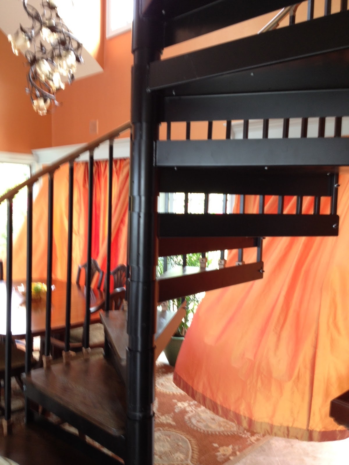
When the breeze captures the hem, it’s more than a flirtatious, sexy Marilyn moment…

I designed the valance to be wide enough for the drapes as well as the solar shades behind them – the shades offer protection from the rays of sun to protect the material, the wood of the dining room table – and our skin.  Shades from Smith+Noble.  www.smithandnoble.com


I had to match the switch plates to the wall color.  Things you never think about! 
So on the advice of our electrician, I took a trip to Chinatown's Lendy-- the go-to the place for all things like this.  


More shopping close to home:
The porch is outfitted with a rug we had in the garage. 
I repurposed a cocktail cart, a table, and the small, gurgling fountain for some nice meditative nature sounds.  

In the end, I opted for the light, open-weave Sunbrella outdoor drapes – even though the color was charcoal.  I
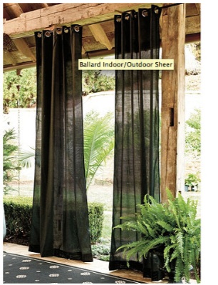
However that color was in canvas and I knew it wouldn’t have the same light, see-through, blow-in-the-breeze texture and look.  And the color looks elegant with the black iron furniture and urns. 

I wanted the “walls” of the porch to “drip” with Sunbrella drapes.   The mildew-resistant drapes are ready made with nickel grommets.  This made hanging easy.
So now, when I do my yoga or have a massage, we can “pull” the drapes for added privacy.  Other times, it’s a sensuous design accent.  I secured the drapes from Ballard Designs.   www.ballarddesigns.com  They are very professional and helpful.

The reconstructed terrace was made whole again by the masons – who were quite cruel with the original.  The colors are cool blue and grays.  I thought the succulent plants would play nicely here. The plants’ architecture and color shades are stunning.  
Love these cool blues & ice grays

The new terrace furniture was supposed to be here for Memorial Day!  It’s on back order.  Digits crossed it makes it oh – sometime this summer!
Patience is a virtue with a home renovation…


Nora’s Lists
In her hysterical, fun-read, “I Remember Nothing,” Ephron concludes the book with two lists: things she will not miss and things she will miss. The New York Times concluded its obit with this reference.   “…Of the things she will miss, begins with “my kids” and “Nick” and ends this way:
“Taking a bath
Coming over the bridge to Manhattan
Pie.”
Pie indeed.  As an homage to witty, literary home design and foodie “friend,” we will enjoy homemade blueberry pie.  With a deserved dollop of homemade ice cream… Enjoyed on our new porch.

Friday, June 8, 2012

Home Renovation Diary Update


The calendar for home renovation seems to be in a similar class as that of dog years. 
Or a space-time continuum.  
It’s just that things go slow, then swoosh along, only to hit a pothole, before racing full steam ahead.  It’s like a motorcar that stops and stalls – but the driver knows he’ll push the throttle and get this baby home!

The Home Renovation Diary Update marks the successful completion of the painting in the home’s addition, and on to the delivery of the reupholstered living room furniture that is styling new shades of a cadet or sea blue for the slipper chair  

and the kitchen island stools, and a softer shaded trompe l’oeil of subtle cornflower to sky blue set off with marquis patterned top-stitching with yellow to gold dot joints (that pick up the kitchen and fireplace and fireplace wall of creamy yellow and gold, respectively, for the two love seat couches – to accessorize the blue bay beyond the living room’s composition  window view perch.


I ordered the kitchen stools online from Ballard Designs.  They are the nicest, most helpful team of decorating professionals. 
The only slight snafu is that I ordered the custom fabric from the local upholstery pro in order to match the living room slipper chair – and he recommended some yards less than Ballard suggested.  He said he only used a little under five yards for the entire chair so couldn’t imagine that they would need near eight for the back and seat cushion.  So I urged Ballard to talk to their outsourced upholstery professional and get them to be more realistic – especially at more than $45 a yard. 
It all worked out and in less than a month or so, the completed stools arrived.

Of course the delivery had to be the morning I was racing to catch the ferry back into town.  And I was waiting for the decorative painter, Stacey, who was designing and completing the wall art, transitioning the loft room color to the garden dining room color.  More on that in a second.

UPS must have smelled my urgency, waiting like a cunning cat till I was at the point of departure, when he knocked the door and fled like a schoolboy prankster.
Now I had to bring in those four huge boxes because my fairy housemothers, aka Mother and Aunt Margaret, wouldn’t have been able to quickly maneuver them inside nor would that be fair to them…  So like a longshoreman, I hauled them in and raced down to the ferry dock – but not before ripping open a box top to peek inside and enjoy my first looks at the lovely new blue counter stools, complete with metal foot kicker, dark brown wood legs and base and silver grommets to match the kitchen appliances.
All the better to sit and enjoy the sky-like blue - complete with clouds - of the marble kitchen island, the cook in the kitchen, and the New York skyline on the other side. 
Yes, the stools turn and spring back to crisp attention.

Blue upholstered stools highlight the blue marble of the kitchen island


I didn’t leave the starting line in my race to catch the ferry before wishing Stacey well on her redo of the wall art transition. 

The wall art started off as a brilliant design concept – dreamed up by me J 
I thought I could capture the extraordinary color transitions from the sunrises and sunsets that we bask in at our home on the water. 
Sunrise from the right and the sunsets from the left are both dazzling, shimmering performance art -- and the color transitions embrace the rainbow spectrum.
I especially wanted to capture that blue to orange syncopation.  

The loft room is Benjamin Moore Dix Blue – mirroring the blue-green water beyond and the patina of the copper I left on the fireplace that was the outside but is now the inside wall. 

The Garden Dining Room is the Martha Stewart Sherbet/Gold shimmering color and texture described in the Garden Glamour Home Renovation Diary Update April

With the two rich colors and the bay view beyond, combined with all the sensual elements in between, I dreamed up an ombre color transition between the two spaces.
 
I tried it out with the wall paints on a spare sheetrock sample. 
It came out good, if I do say so myself! (I also do watercolors and I’ve been told that my final colored landscape design “blueprints” are like works of art.  Some of my clients frame them.)
Everyone liked my ombre.
I couldn’t wait to add my personal Georgia O’Keefe artwork to our home and join the lads painting away on other parts of the addition. Ha!
Alas, it was not meant to be. 
Shockingly, I discovered I have a kind of vertigo.  I’m afraid of few things, and this was most embarrassing to learn that without a railing up (too early for that), I couldn’t lean over, or even get close to the edge of the loft in order to render my ombre… Even if Bill held my waist, which is really no pose for a working artist, anyway. 
This was a big setback in more ways than one.

But Roy, the painter was magnanimous, saying no harm in the vertigo admission. In fact he knew of someone who he thought could do the job. 
Crunch to the budget. I hadn’t planned on this expense…

Soon enough, we were working with Stacey.   
She seemed confident, talented, possessed a great online portfolio – and most important, was not afraid of heights.

She saw my painted design sample and said no problem.  We exchanged some emails during the week about the design.  We wanted a small footprint between the rooms, as there is nothing separating the rooms.
I didn’t want someone to walk into the room and exclaim about wall art – as divine as it could be in it’s own right – but rather to admire the soaring ceilings, the sunlight or moonlight streaming in – and that glamorous Martha precious metals sherbet wall color we’d worked so hard to achieve.

Not to diminish the decorative art, but we didn’t want a mural.
I realize ombre takes space, but thought we could modify the process to suit our needs. 
PDF rendering of suggested ombre for wall scanned in on actual wall & colors. Declined. Too much!


By the end of the week, we thought we got it, despite some rather elemental pdf visuals where Stacey took the sunrise image and compressed it on the digital image of the wall. 
With fingers crossed, and hopes high, the following Saturday was art-in-the-addition day. 
We had agreed that an ombre like solution could be a series of the rooms’ colors: blue, peach, pinkish, and sherbet -- blending or morphing into one another – from the blue to the sherbet.  Nice, gentle transitions – like the horizon at sunrise…

I spent the time writing upstairs in the La Boheme-like garret that was and soon will be again: the guest room; while Bill worked putting on the door handles in the addition room below the loft where Stacey was creating. 

The art work didn’t start off too good. In fact, there was an initial whoopsie that took my breath away. 
As Stacey started up the ladder with paint can in one hand and brush in the other, the ladder started to slip away off the loft!  I was speechless, gesturing to Bill with my hands. Stacey had so much presence. Rather than go back down, which is natural I think, she scampered UP the ladder as it slipped away.  If this hadn't been so loaded with disaster, it would have been acrobatic entertainment.

With breathing restored and all precautions reviewed, we were back to our stations.
I never want to oversee or make the professional artisans or trades nervous with someone looking over their shoulder so if I’m home, I make sure to stay out of their way.
Later that afternoon, with the work finished, it was time for the look-see inspection.  I was filled with trepidation. Just like when Roy called me to see the finished sherbet painting.
Unlike that inspection that yielded heart-holding joy, this one was more of an “oh dear.” 
I was tilting my head. Looking at it from different sides.  But it was so much like a rainbow!  The colors were too distinct. Too obvious. No nuance.  With courtesy and caution, Stacey and I reviewed and she said she could remedy it. 

Back to the garret.  An hour or so later: another call to have a look-see.  My heart sank. Same reaction.  Instinctually, I didn’t like it.  Stacey knew it.  We couldn’t look at each other.  The deed was done. 
It was getting late – near cocktail hour.  We agreed we’d live with it a bit. 
We did. For less than a week. 
We asked Stacey to come up with some other solutions.  She did.  She sent us this. 
We agreed to do in our colors.

She returned the next week and redid the wall (for more guilders), after we had to have Roy come back and redo the primer.
The result is it is beautiful, original art and is a conversation piece – in a good way.


We love it.

You?

The “little things” make a BIG difference.